CASE STUDY:
Microsoft Support Center Redesign
THE PROBLEM
The SMC team identified that getting help on Microsoft.com was unnecessarily difficult due to siloed business units, resulting in fragmented and inconsistent support experiences. Customers also lacked a central place to manage their accounts, forcing extra time and effort. As device and subscription offerings expanded, the existing support experience no longer met customer expectations.
ROLES & RESPONSIBILITIES
» Research
» Stakeholder interviews
» Competitive & comparative analysis
» Task flows
» Content strategy
» Link strategy
» Information architecture
» High-fidelity wireframes
» Design direction
Audit and analysis
Discovery phase consisted of the following tasks:
Stakeholder interviews
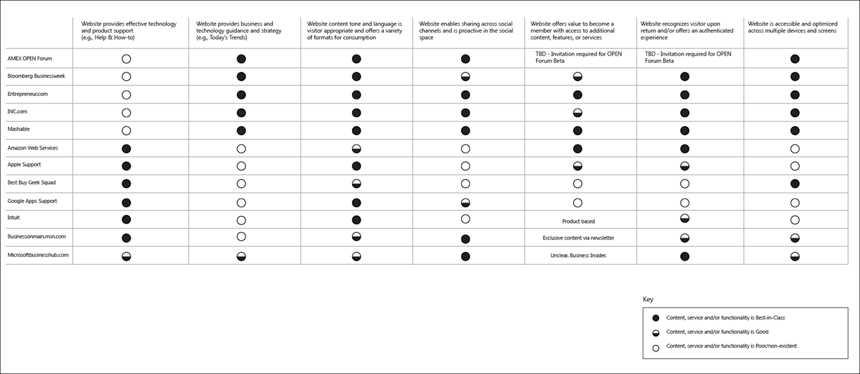
Competitive audit support sites with final analysis
Microsoft Support IA audit and analysis
Microsoft Support task flow audit and analysis
Scenarios uncovered
Intensive discovery period revealed the following scenarios that the revised support site had to account for in order to meet customer expectations.
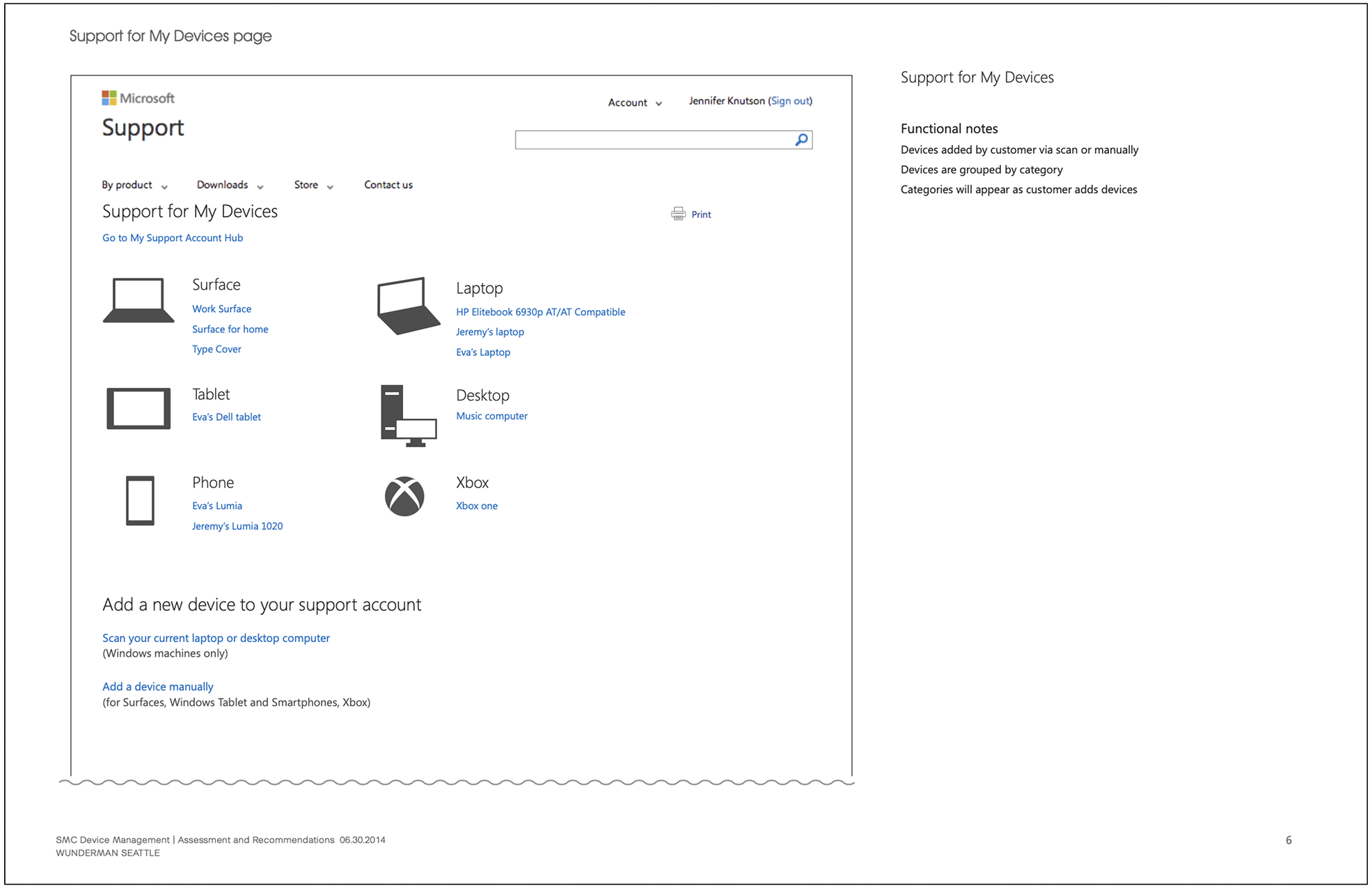
Customers may have a range of devices
Third party devices
Microsoft devices
Microsoft hardware
Windows phone
Xbox
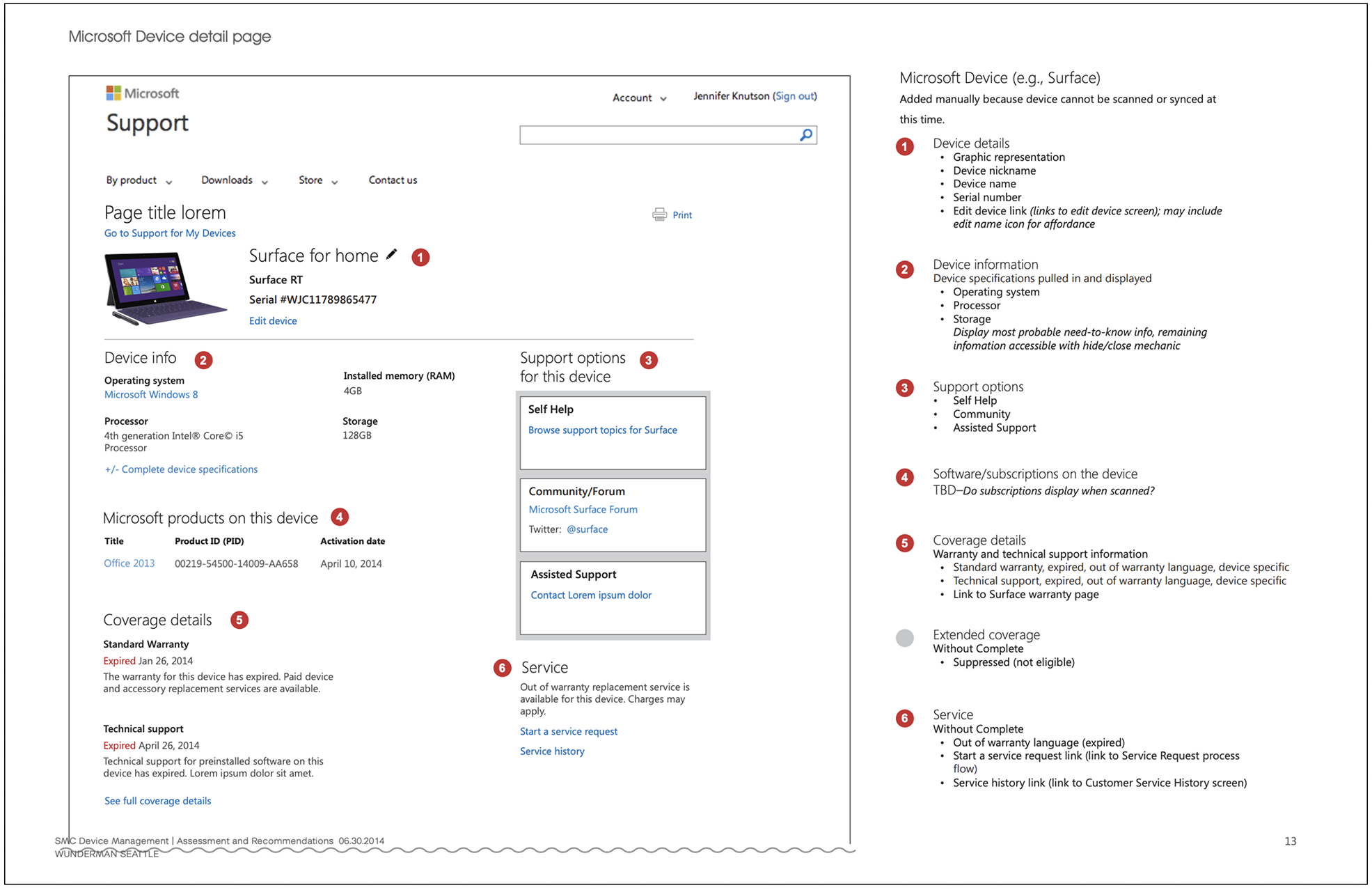
Device information varies and needs prioritization applicable to the device
Operating system
Processsor
Storage
RAM
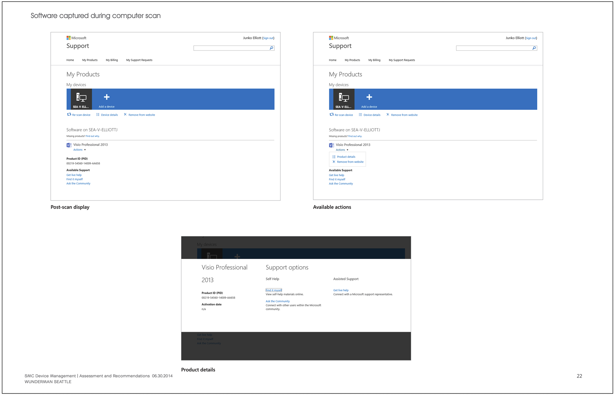
There may be Microsoft software on a device (that is not a Microsoft device)
Title (Word, Excel, Powerpoint)
PID (Product ID)
Activation date
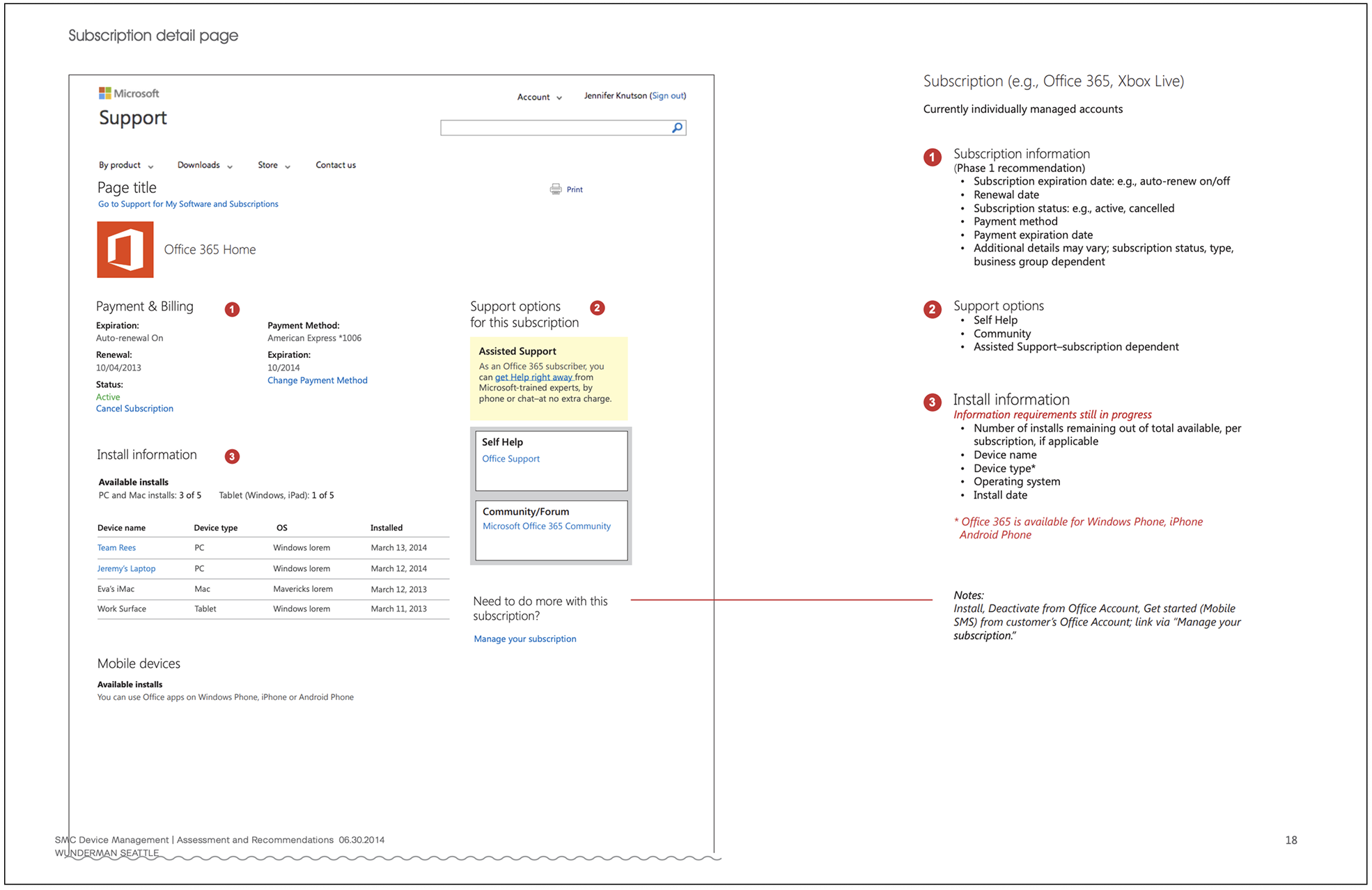
Coverage details are time sensitive and vary by manufacturer
Standard Warranty
Technical Support (Warranty specific to device)
Status: Active or Expired
Extended coverage is a factor
Support option details vary by device
Third party - manufacturer’s link
Self Help
Community
Social media
Assisted Support
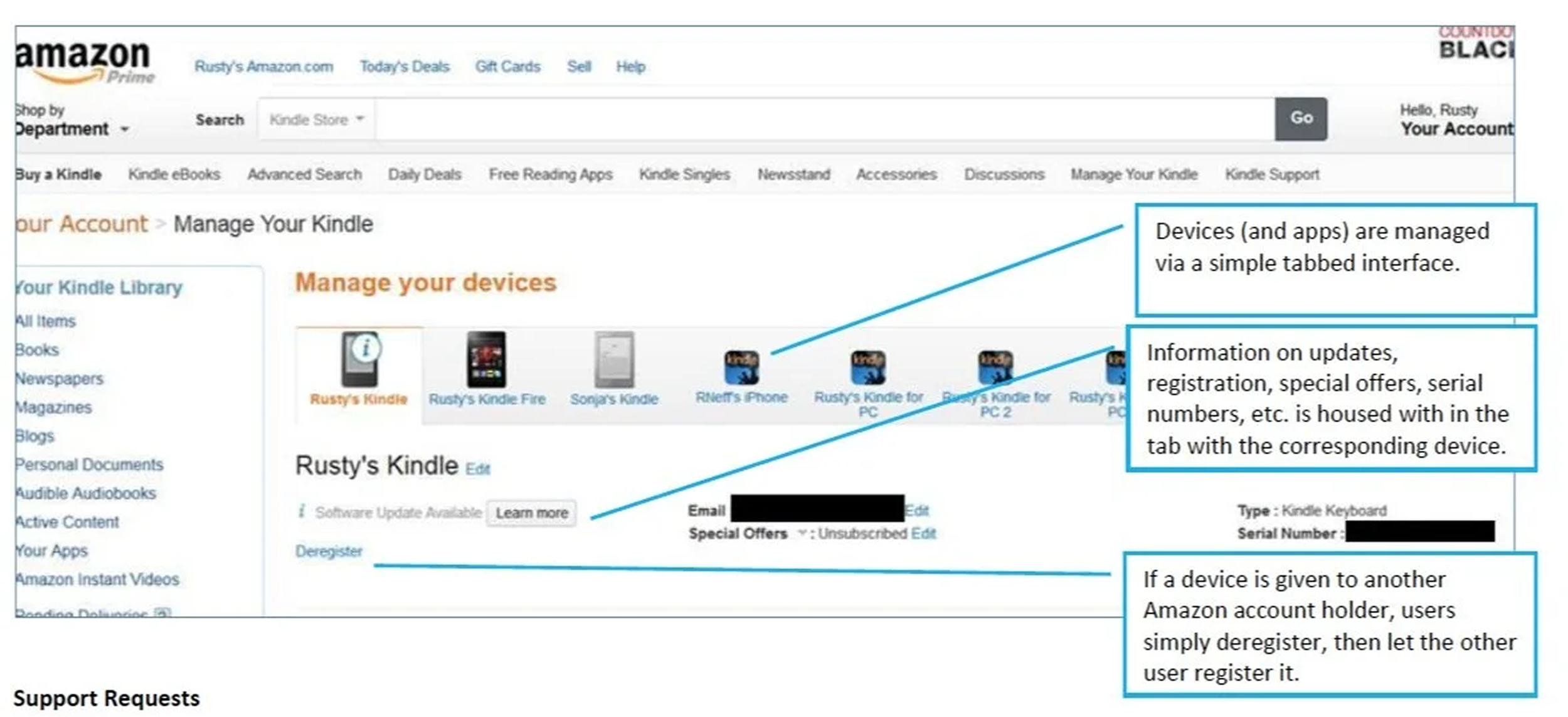
Customers have more than one way to add a device to their support account
At system startup
Via system scan
Add manually
Experience strategy and success definition
In order to meet customer expectations of a comprehensive, intelligent useful support experience, Microsoft Support Site needs:
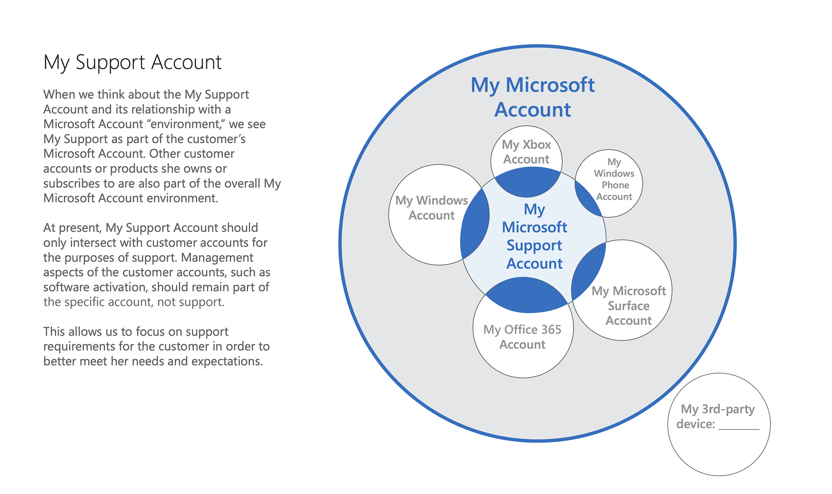
Unified support strategy: make it easy to locate, access and consume service and subscription information across all devices for the purposes of support; it should feel natural and logical.
Device Management should be framed within the context of Support, not separate.
Content considerations should be determined based on what customers are most likely to need for support purposes as it relates to service, subscription or device support scenarios.
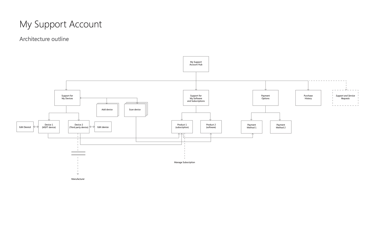
Information Architecture
A unified content strategy was needed to replace fragmented, business-unit–driven support content with a consistent, customer-centered experience, supported by a scalable information architecture and intentional linking strategy to ensure clear paths forward and no dead ends—now or as future products, subscriptions, and devices are introduced.
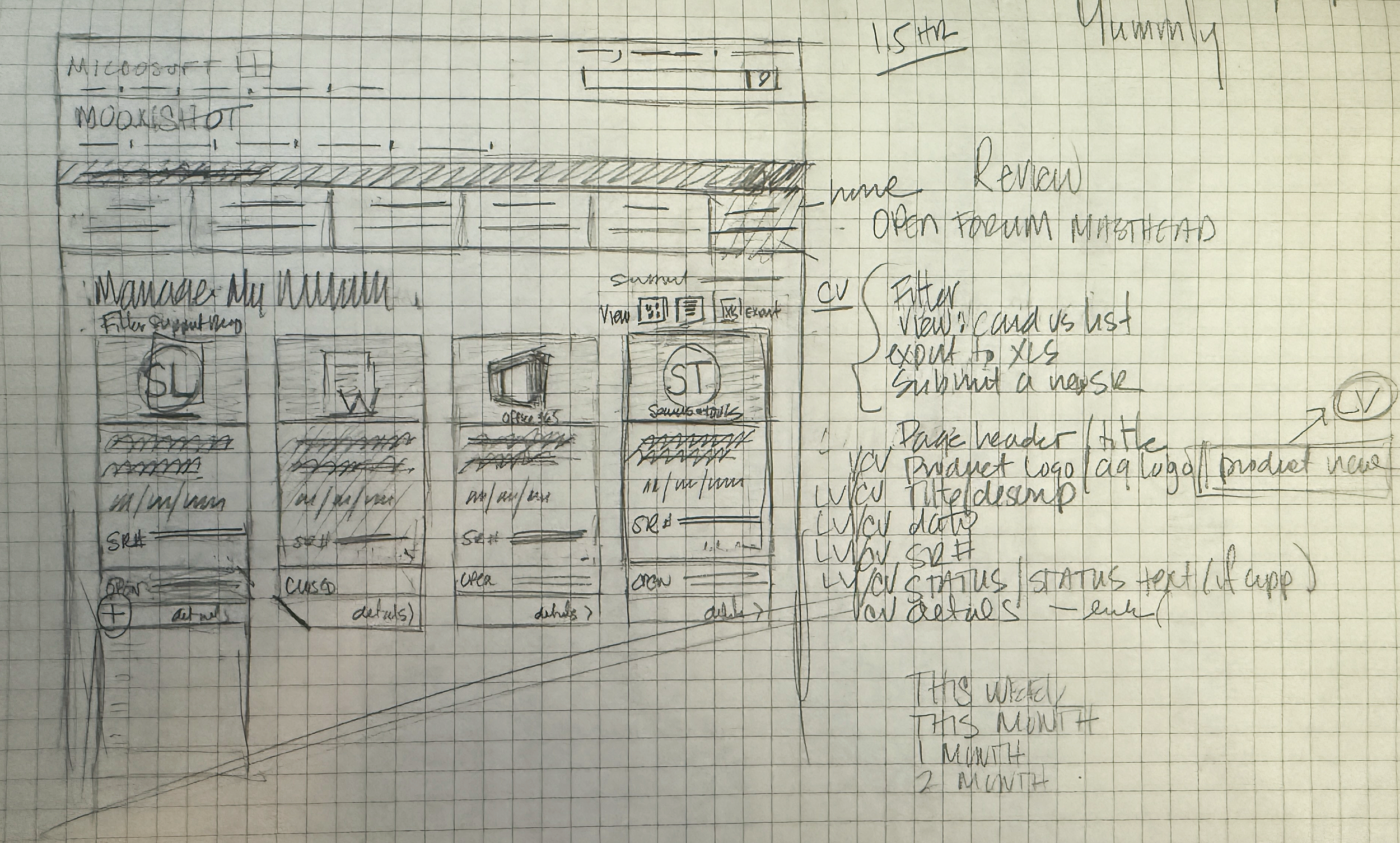
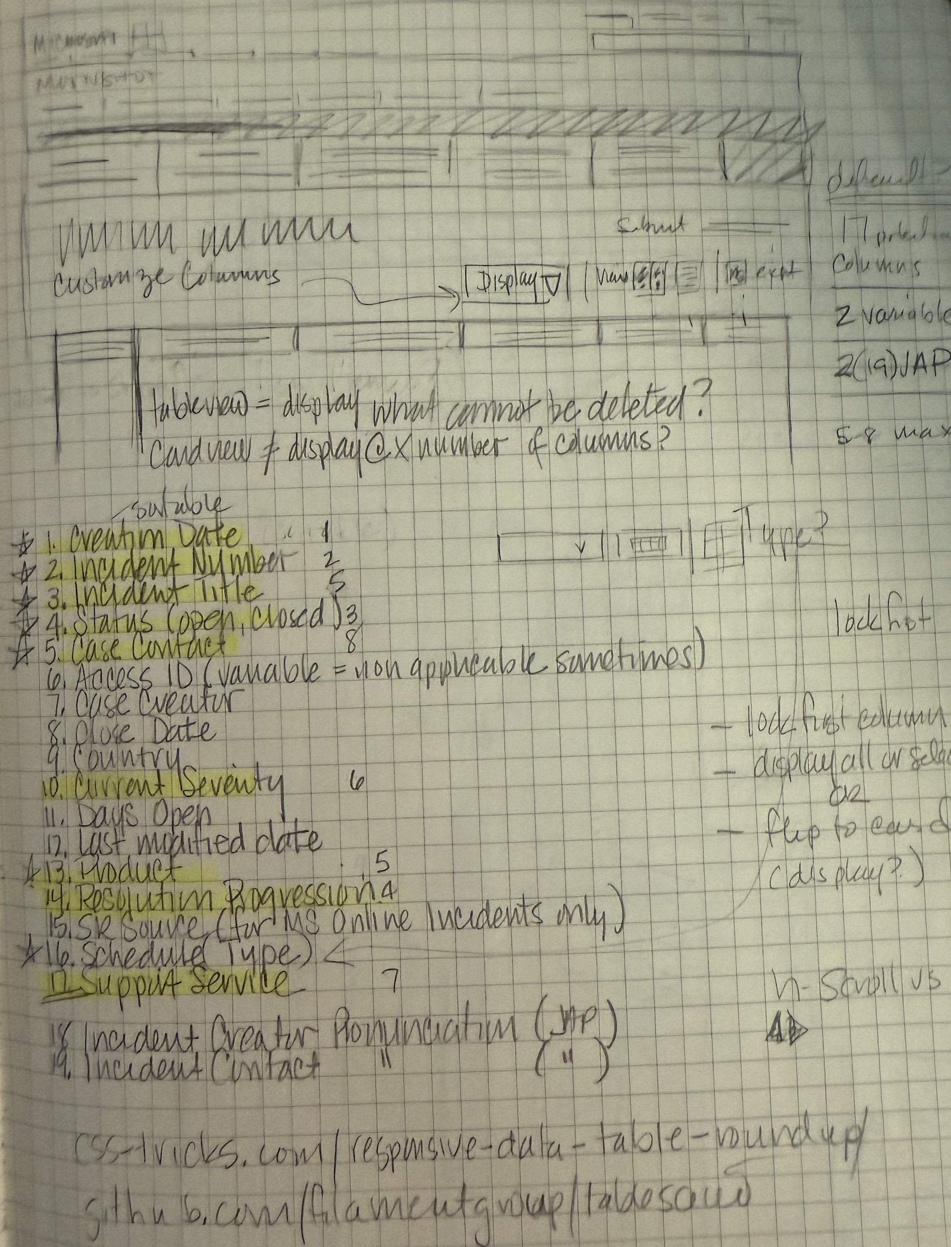
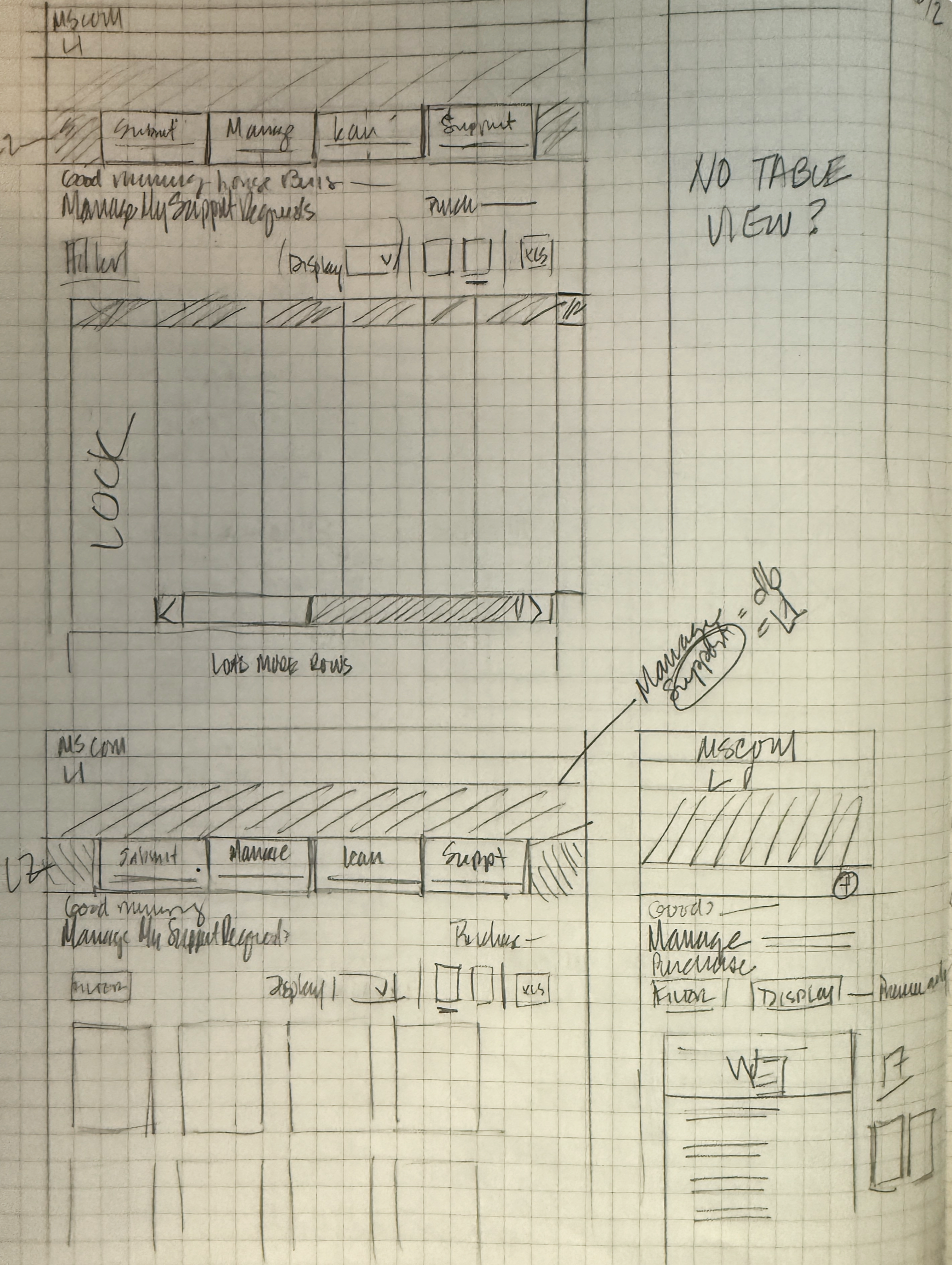
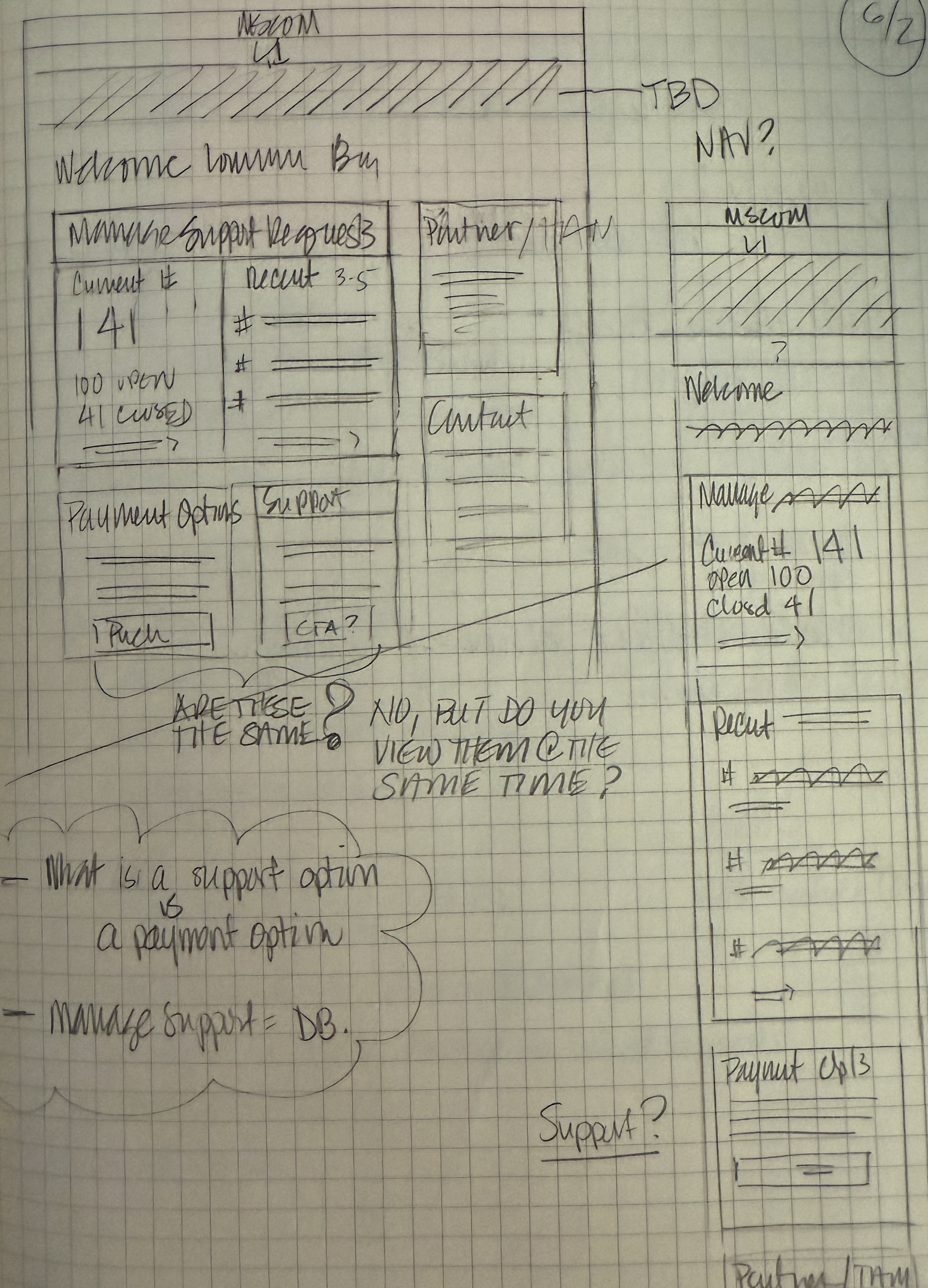
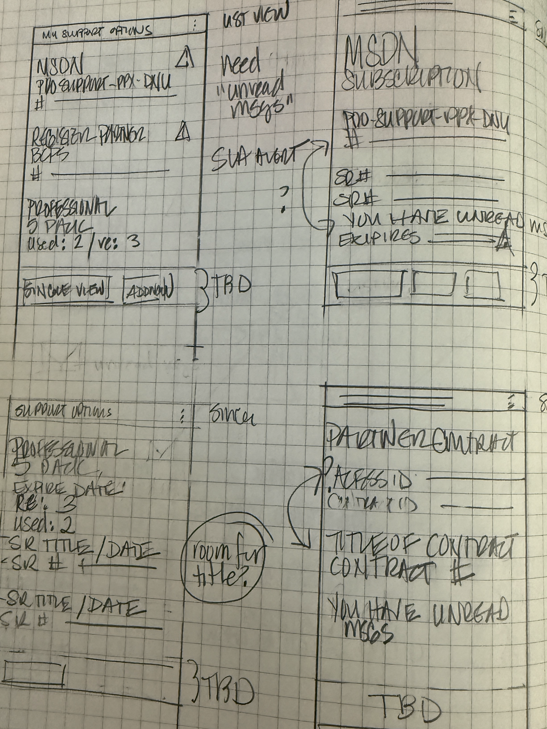
Sketches > Wires > Comps
Rapid iteration using high-level sketches jump-started ideation with designers and clients, allowing us to quickly discard ineffective patterns and focus on solutions that were easy to templatize, reducing churn and rework.
Final experience
The redesign refocused the site around its core purpose by removing unnecessary clutter and simplifying decision trees and process flows. A unified content strategy established a clear, recognizable visual hierarchy, making information easier to scan and understand. The experience was also updated to work seamlessly across screen sizes and operating systems, improving access for all customers.