Mini Study: REI.com
Website Redesign
Client: REI
Project: REI.com redesign
Responsibilities: Research & Discovery, Competitive & Comparative Analysis, Task Analysis, Site Architecture, Wireframes, Best Practices consultation
Challenges: REI was in the midst of a brand refresh and visual identity update that were constantly changing and impacting our timeline and design deliverables.
Ultimately we provided a design strategy document for REI to utilize when they were ready for full implementation.
The problem:
Recreational Equipment Inc (REI) is known for the quality and character of its brick-and-mortar store environments, sales associate (aka "Green Vests") knowledge and genuine enthusiasm for discovering the outdoors, and its passionate community members. Like many online retailers, REI had come to the realization that what made them special was not mass product and lowest prices, but brand integrity, service and expertise. REI wanted its website to better reflect the in-store environment, Green Vest expertise, and community experience without interfering with the shopping funnel and purchase process.
Discovery: Comparative/competitive analysis
As part of the discovery process, I conducted a comprehensive audit of REI competitors ranging from large sporting goods suppliers to niche retailers: Cabela's, Dicks Sporting Goods, Backcountry, LLBean, Sports Authority and Amazon. Each site was rated on a scale of 1-5 (5-Best) for the following: Discovery and browsing, schemingPre-sales guidancePost-sales guidanceLocalalityCross deviceBrand differentiation
The goal of the audit was understand the landscape and determine where REI had opportunities to excel in their customer loyalty, knowledge and product superiority.Defining design patterns
The project required an agile approach across all phases. Design patterns were mapped out on whiteboards in collaborative brainstorming sessions with REI UX and Content team members, then translated into high fidelity wireframes and delivery files.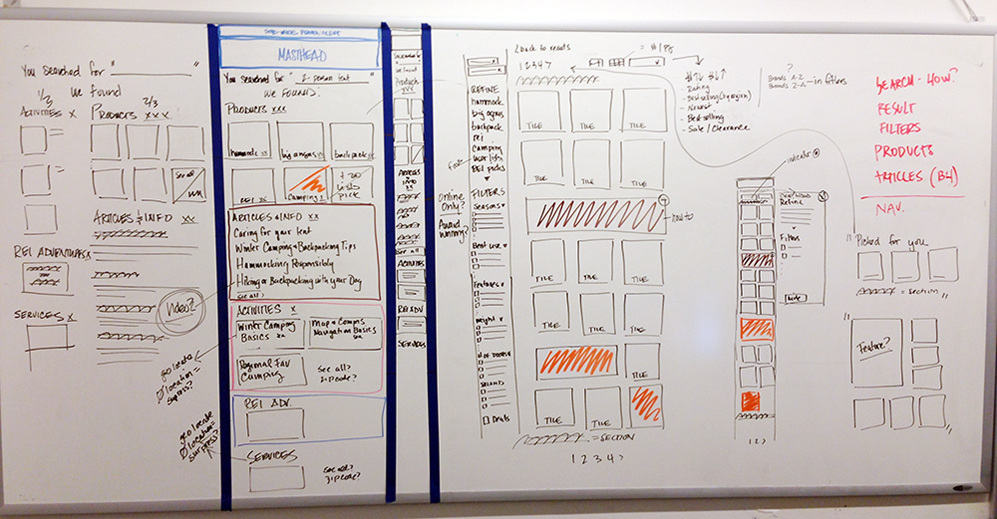
Balancing expertise & product
One of the largest content strategies I helped craft (up to that point) was determining the ratio of outdoor expertise content (e.g., "selecting a tent") to product gear (e.g., "tents for families") across the shopping funnel. It was a critical step that aligned with the page templating.User exposure
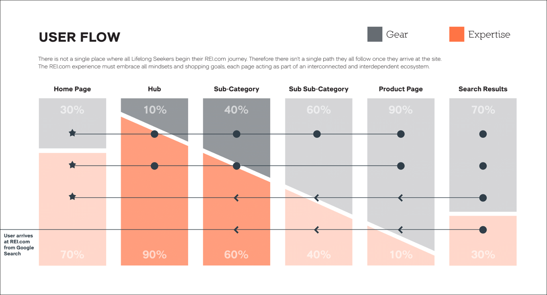
Once the expertise and product ratio was mapped, user entry and exposure was mapped to determine the various expertise and product touch points across the site. It was critical that the journey, regardless of entry point, be logical with the ability to pivot successfully if necessary.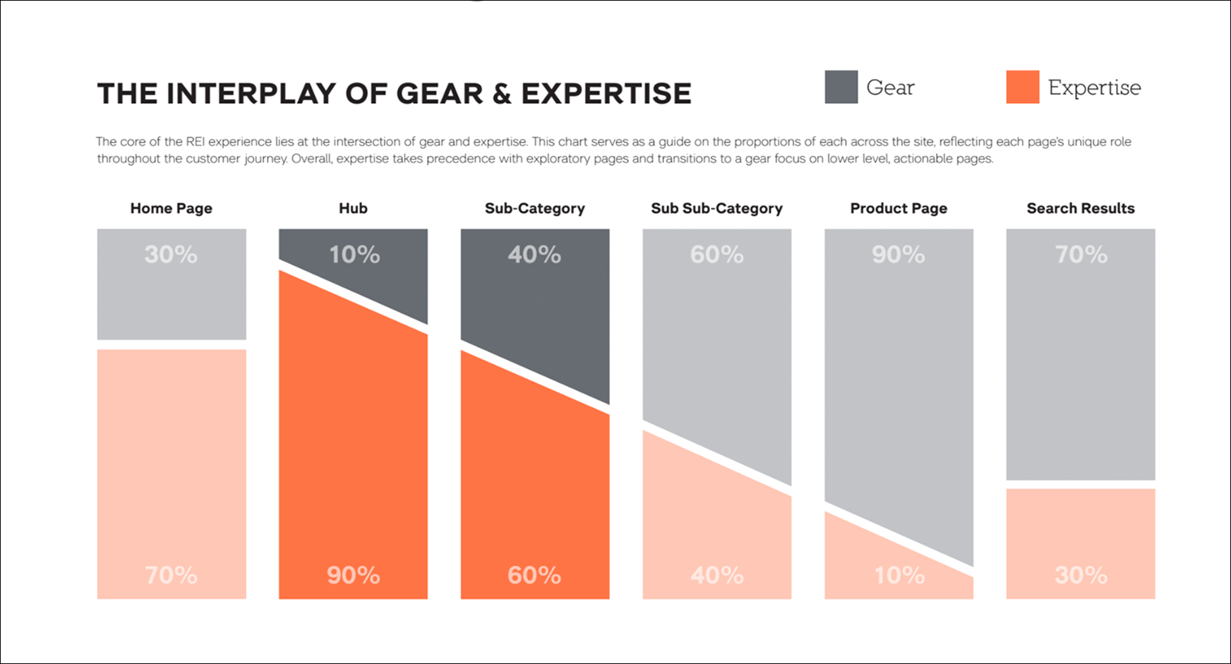
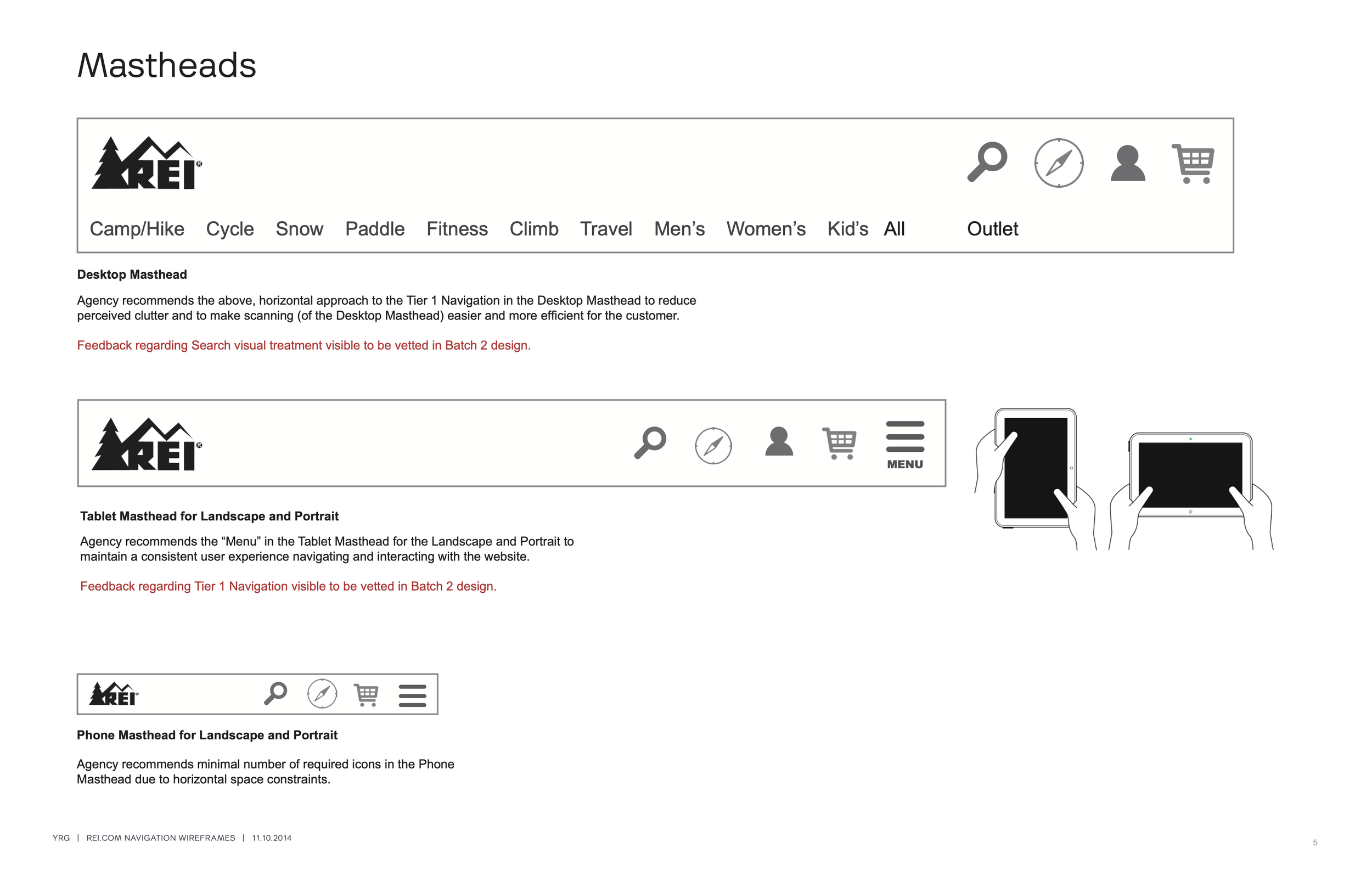
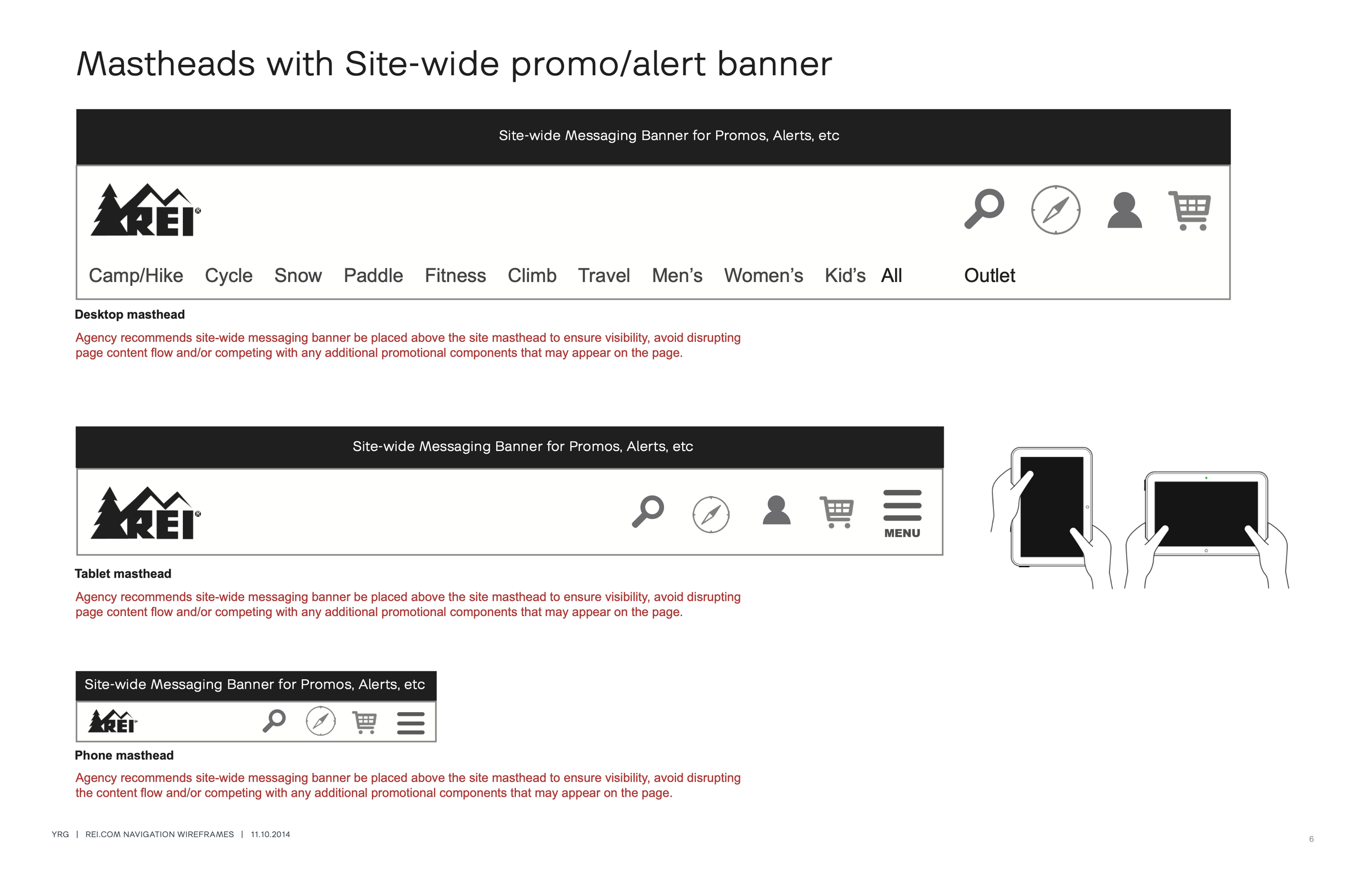
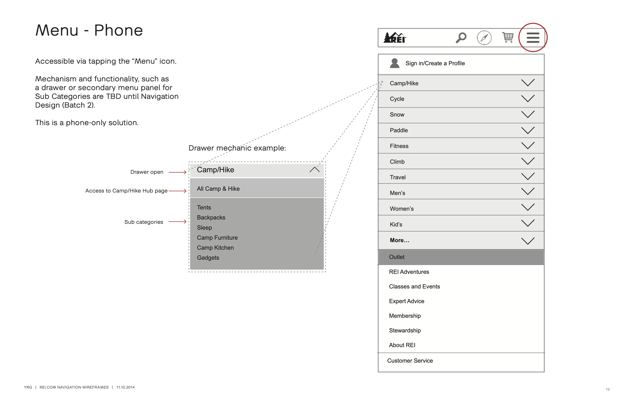
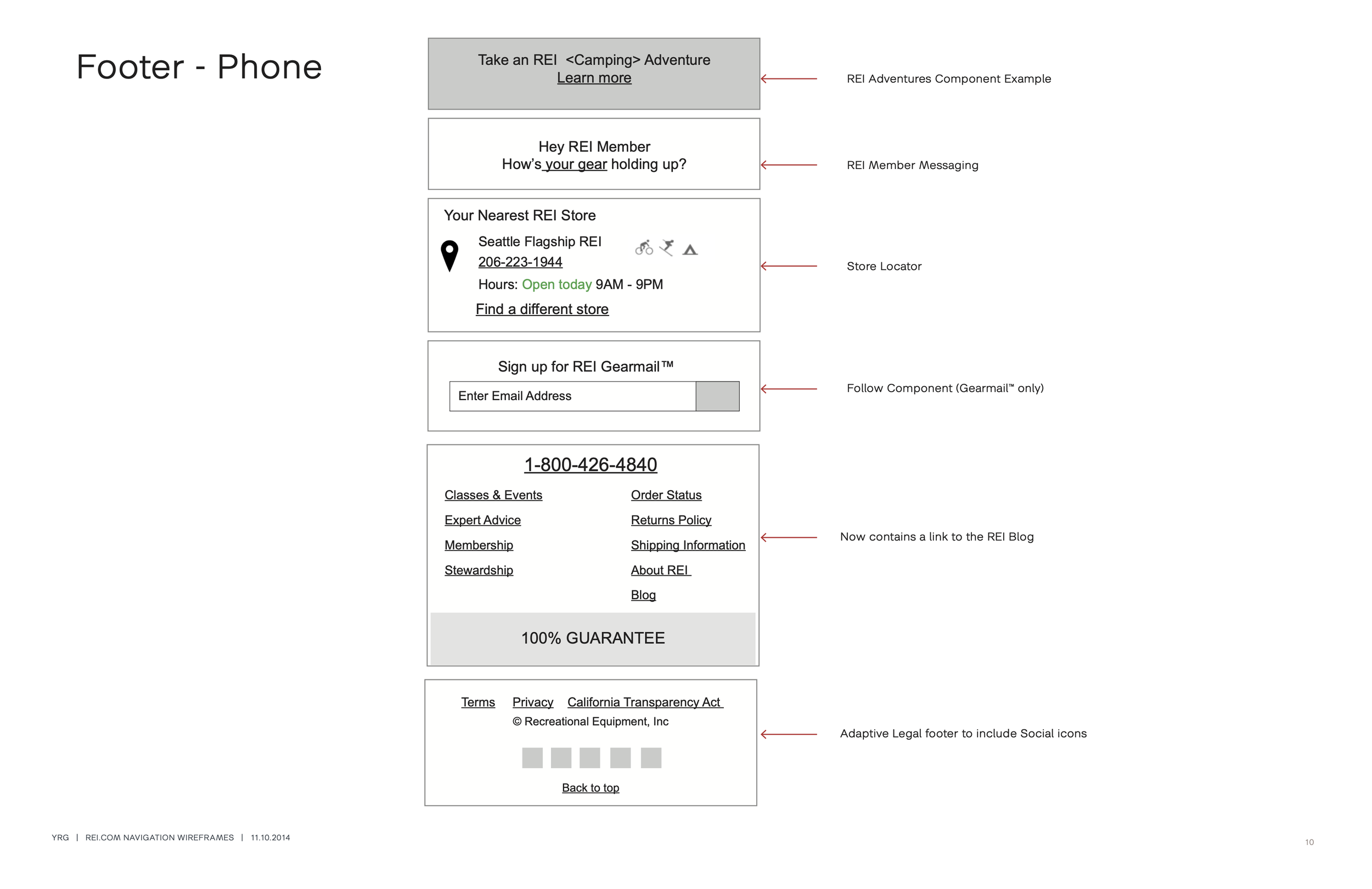
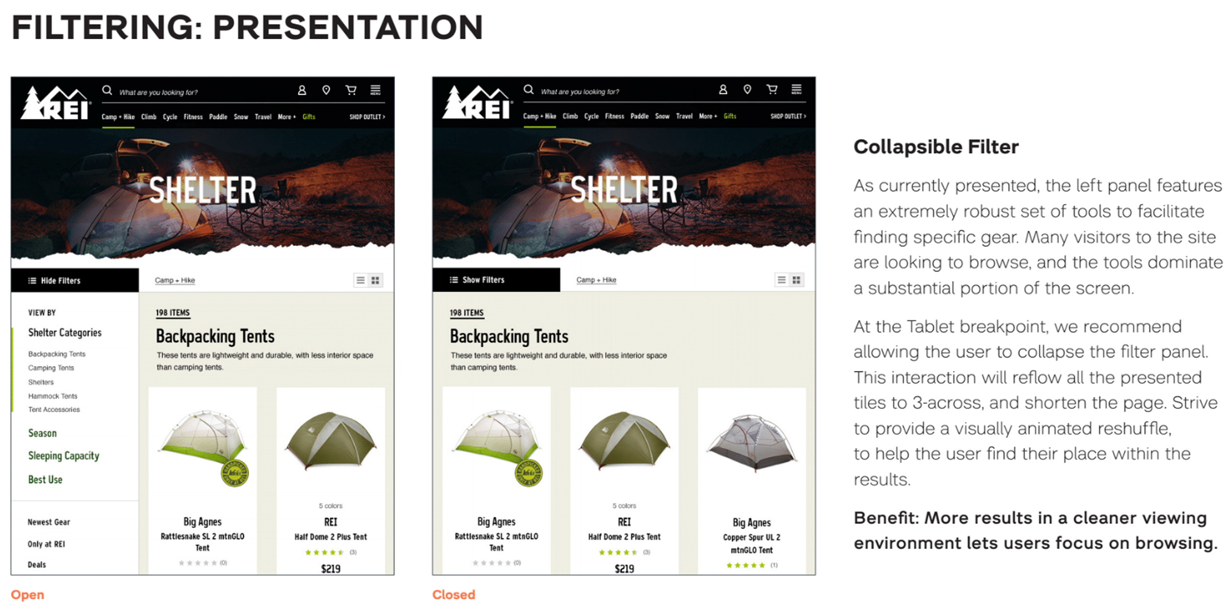
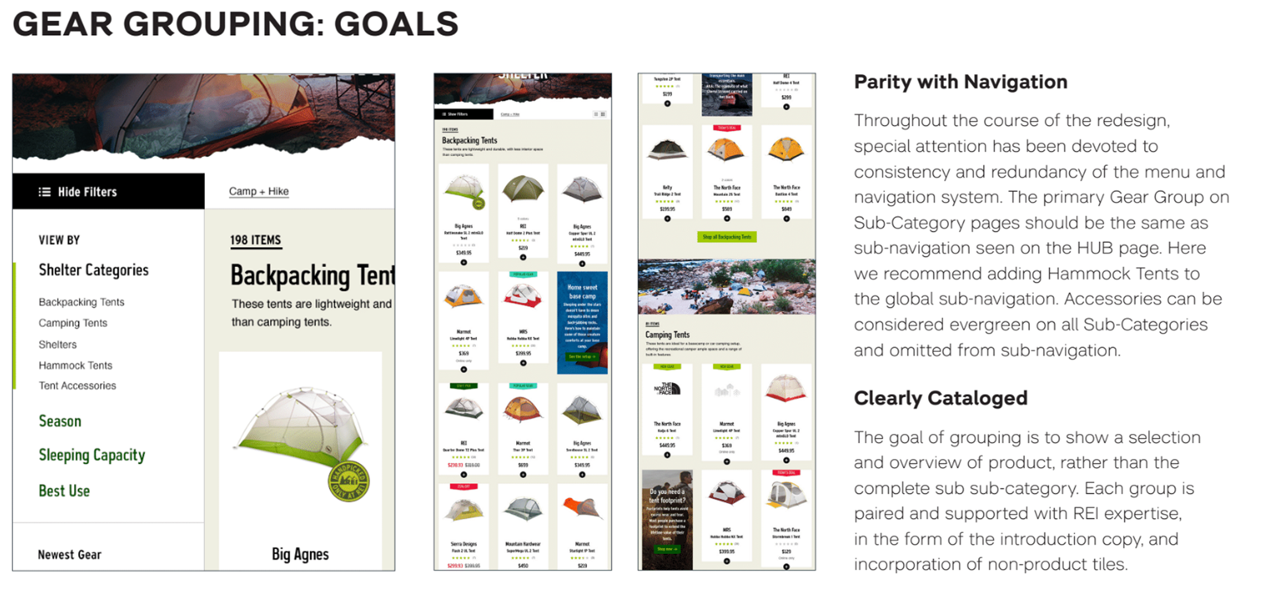
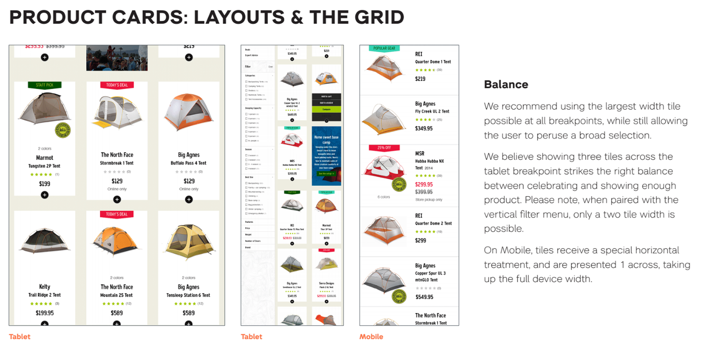
High fidelity wireframes
High fidelity wireframes represented the final information and hierarchy requirements, which were then translated in to polished UI concepts. All of the UI deliverables were accompanied with best practices for eventual implementation. Wireframes were scheduled to be delivered in a series of document drops.
Final deliverables
The final outcome was the shift in delivering a responsive website to the creation of an extensively detailed e-commerce strategy and implementation guide that would enable REI to build their e-commerce experience when their brand refresh and updates were complete. 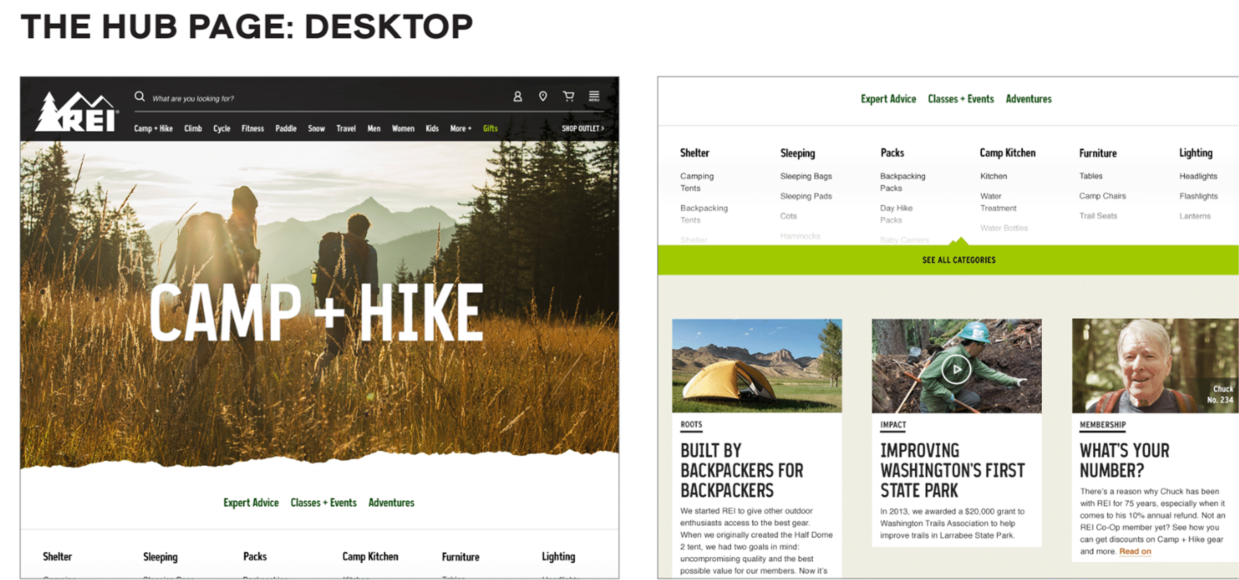
Status update: 2026
The current REI experience retains much of the information architecture, content strategy, and UX/UI recommendations and designs created by myself and the team.