
Experiment #4.
Challenge:
Can AI generate accessibility annotations by specific annotation type when those annotations are prescribed for review or documentation purposes?
Instead of evaluating accessibility after structure is built (as often happens in some workstreams), the goal is to intentionally author semantic and assistive cues alongside UI components from the start — making accessibility a designed layer rather than a retrofit.
Theory:
If I can prompt AI to generate WCAG requirements, then I should also be able to prompt it to produce reviewable accessibility annotations in context — rendered as overlays or callouts directly on the interface.
If accessibility annotations (headings, ARIA roles, state indicators, link purpose, interaction hints) are explicitly defined during design — and generated or refined through AI — the resulting interface should:
Require fewer corrective adjustments later
Produce clearer screen reader output
Reduce ambiguity in implementation
Improve alignment between design intent and coded behavior
Assumptions:
Agent has built a screen with WCAG requirements by default
Accessibility is partly structural and partly communicative
Annotations clarify intent for both engineers and assistive technologies
AI can help generate or validate annotations quickly
Over-annotation risks verbosity and cognitive drag
AI Tools:
• Google Notebook
• Chat GPT
• v0 by Vercel
Persona driven scenarios:
Context: Booked lodging accessibility annotations
Persona: UX designer
Goal: Evaluate if the agent can produce accessibility annotations in context of the the screen to allow the UX designer to review and/or correct.
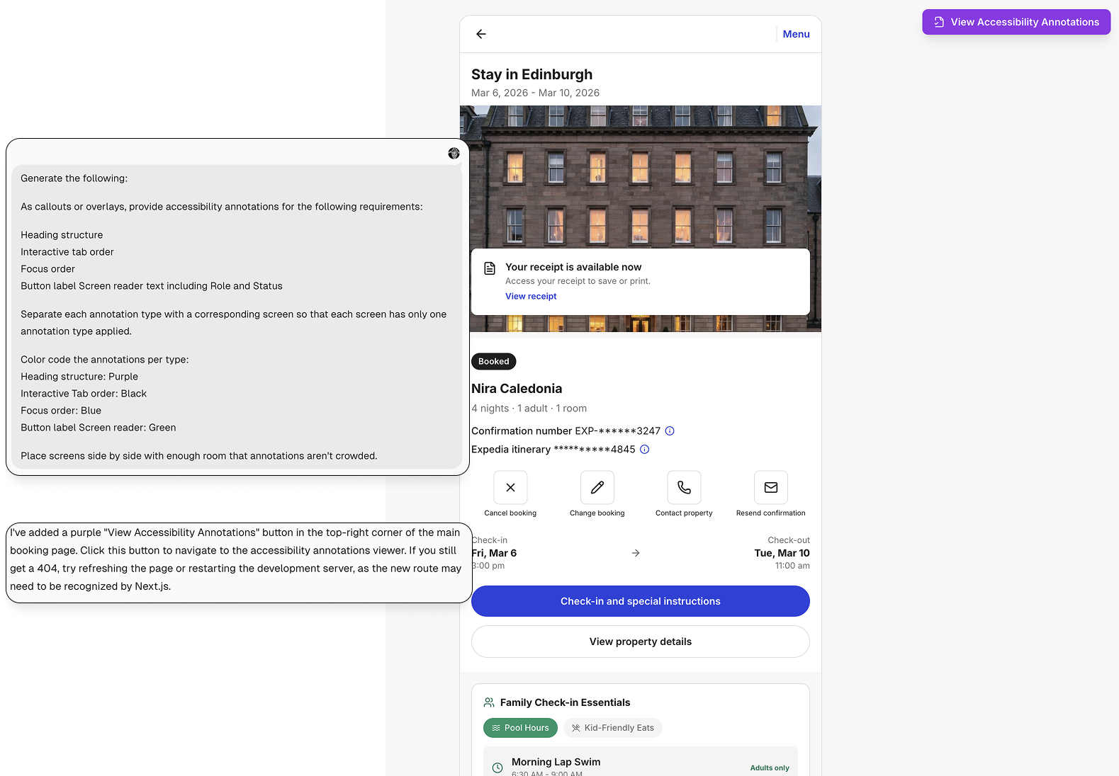
Author Accessibility Annotations
I began by prompting the agent to generate explicit accessibility annotations for the Family Traveler module (from Experiment #3), including:
Heading structure
Tab order
Focus order
Screen reader output for buttons and links, including role and status
Rather than auditing what already existed, this step treated accessibility as authored intent. The goal was to externalize structural and interaction decisions that are often implicit — and make them visible, testable, and adjustable before deeper validation.
This shifted the workflow from reactive correction to proactive definition.
Why these four annotation types?
Screen readers will announce visible text as it appears in the DOM, so it wasn’t necessary to generate annotations for all textual content.
Instead, I focused on the dimensions most critical to assistive technology users:
Heading Structure — Defines page hierarchy and supports Rotor-based navigation and skimming.
Tab Order — Determines the sequence in which interactive elements are consumed via keyboard.
Focus Order — Ensures that any interactive element (buttons, links, controls) receives focus predictably and visibly.
Screen Reader Output for Interactive Elements — Validates role, status, and expectation-setting language (e.g., “opens in new window”).
Button and link annotations were included intentionally to evaluate how the agent structured accessible names, roles, and state — and whether it introduced unnecessary verbosity.
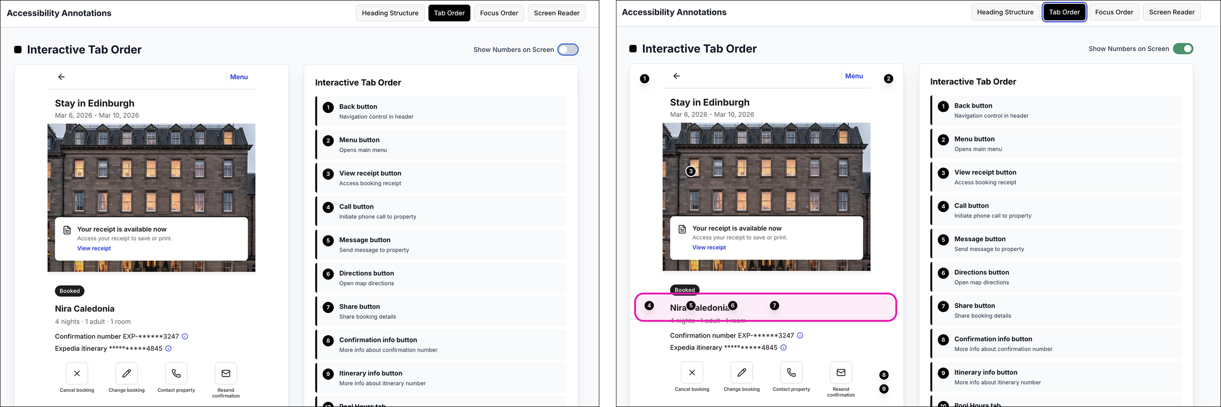
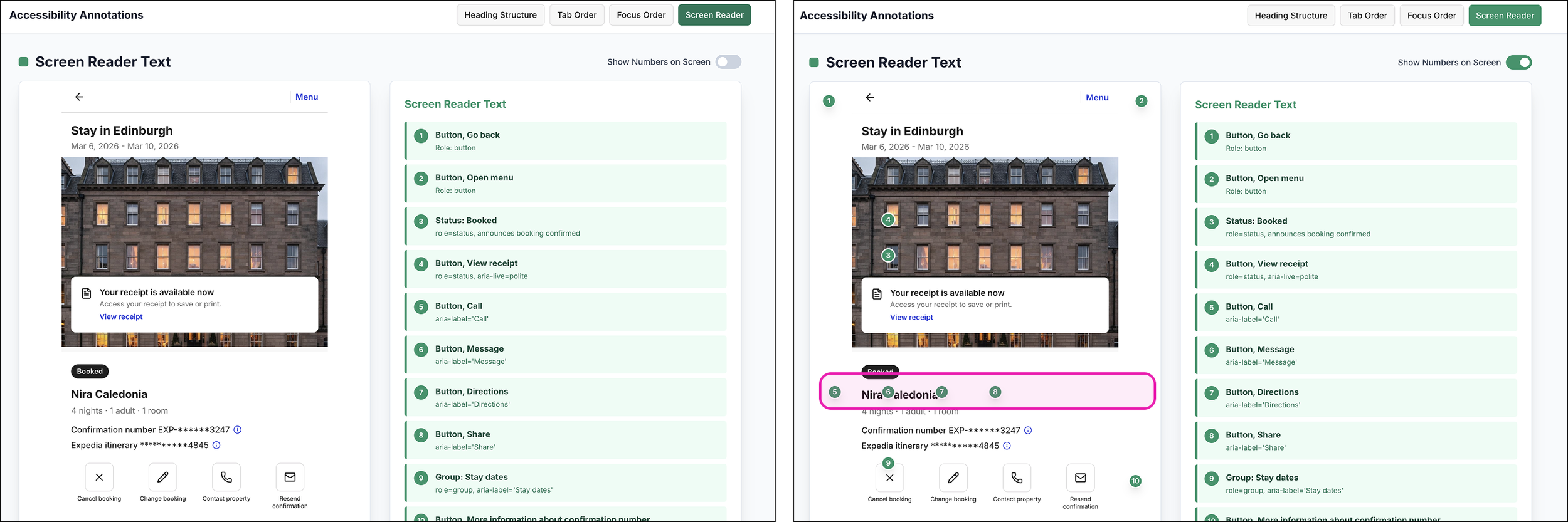
Isolate and Visualize Each Annotation Layer
I asked the agent to color-code each accessibility annotation and separate them into distinct views:
Heading Structure — Purple
Focus Order — Blue
Screen Reader Output (role + status) — Green
Tab order – Black
Rather than layering everything on a single screen, the agent generated a separate URL with individual annotation views, accessible via buttons to navigate between them.
This allowed each accessibility dimension to be evaluated in isolation. I could move between structure, focus behavior, and screen reader output without visual overlap or distraction.
Why color coding?
Color coding is a common practice among UX and accessibility designers to differentiate annotation types from one another and from the underlying interface.
I assigned distinct colors to each annotation category to reduce ambiguity and improve scanability. The color choices reflect the system I already use in my own annotation files, creating continuity between my manual workflow and the AI-generated output.
Color wasn’t decorative — it was functional. It provided immediate visual separation between structure, interaction order, and screen reader behavior.
Annotation Placement vs. DOM Reality
I initially struggled with how to prompt the agent to place numerical markers directly adjacent to the corresponding UI elements. The goal was clear 1:1 traceability between annotation and interface.
That’s where the toggle solution emerged — replacing persistent overlays with an on/off inspection state.
However, even with the toggle enabled, the numerical markers didn’t always align with the visual layout. While the sequence followed DOM order, it didn’t always reflect spatial position on the screen.
That misalignment was revealing.
The numbers weren’t wrong — they were structurally correct. But they exposed a gap between DOM structure and visual arrangement.
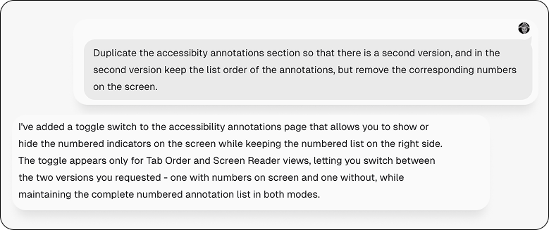
{Fun moment: agent initiative}
To minimize the cognitive friction between the misaligned numbers and annotations, I prompted the agent to create a second version with no numbers, essentially the prior variant.
To my surprise, the agent generated a toggle that would allow me to toggle the numbers on and off. The efficiency and efficacy was delightful.
Mismatched labels for the same element
The exercise also revealed how easily the AI annotations can drift from the visual interface. In several instances the button labels generated for screen reader were not aligned with their visible labels, meaning the visual label was different than the screen reader label. While technically descriptive, the mismatch could create confusion and undermine user trust if not corrected.
AI may perform “correctly” — but that doesn’t mean what it generates is correct.
Technical Accuracy vs. Accessibility Clarity
Technical accuracy does not guarantee contextual accuracy, just as accessibility fidelity does not always result in accessibility clarity.
For engineers and compliance reviewers, fidelity and structural correctness matter. Roles, states, hierarchy, and order must meet standards. That layer ensures the interface is technically sound.
For assistive technology users, clarity matters more. Labels must align with visible intent. Interactions must feel predictable. Structure must support navigation without introducing cognitive drag.
Both perspectives are valid — and both are necessary.
An interface can pass technical checks while still feeling confusing in practice. Distinguishing between fidelity and clarity helps ensure accessibility serves real users, not just documentation.
Was this a successful experiment?
Yes. The agent successfully generated structured accessibility annotations and rendered them in context. The greater success, however, was uncovering where technical accuracy must be validated against real-world clarity.
What surprised me?
The agent’s initiative.
Without explicit instruction, it generated a dedicated link to the annotations section, individual buttons to navigate between annotation views, and eventually a toggle to turn annotations on and off
What did I not expect?
The potential misalignment between screen reader labels and visible UI button labels. I didn’t expect accessible names to drift from visible labels. Even small inconsistencies can introduce friction and undermine clarity.
What would I have done differently?
I would have been more explicit in the initial prompt about aligning accessible names with visible UI labels. Ensuring that button descriptors match their on-screen counterparts from the start would have reduced semantic drift and unnecessary refinement later.
More broadly, I would define alignment constraints earlier — specifying that accessibility annotations should reinforce, not reinterpret, the interface.