
Experiment #6.
Challenge:
Can an AI agent integrate brand guidelines and operate at a meaningful level of design exploration and implementation without heavy prompting?
Theory:
If agents can generate structurally sound, brand-aligned outputs with minimal instruction, they could accelerate stakeholder reviews and pre-implementation validation.
Assumptions:
Prompt clarity is consistent.
A screenshot + instruction anchors structural reconstruction.
Agents have access to publicly available brand guidelines.
AI Tools:
• Google Notebook
• Chat GPT
• Loveable
Persona driven scenario:
Context: Booked lodging designs, accessibility annotations
Persona: UX designer
Goal: Generate a web-ready screen from an existing screenshot, test dynamic content modules, implement branding and test for accessibility
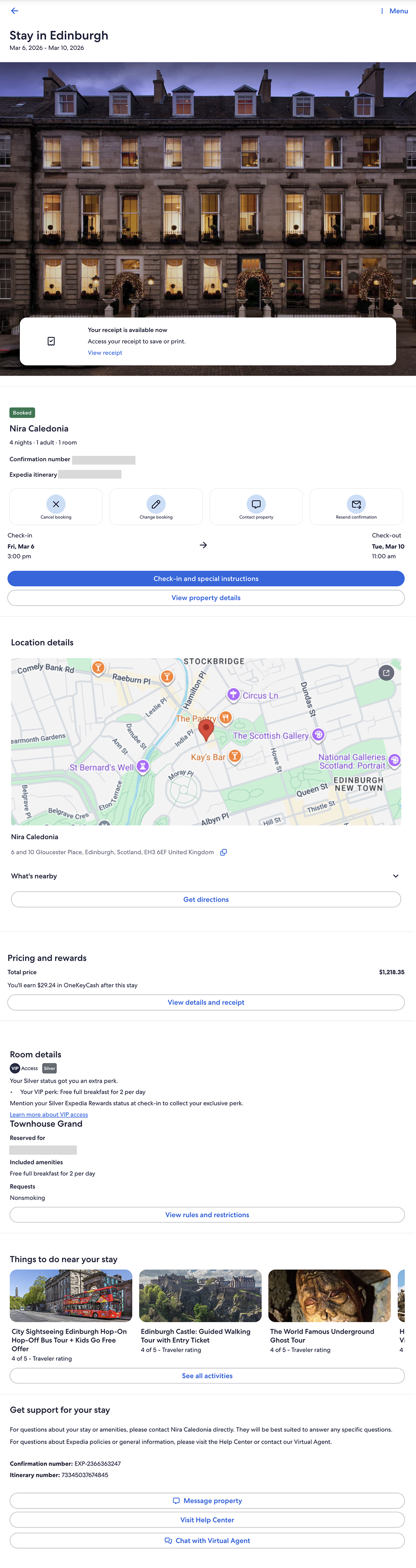
What I started with
A post-booking lodging confirmation screen (mobile), used as the structural baseline.
Structural Reconstruction
After Figma Make failed to generate an accurate web-ready screen, expectations were low.
Loveable successfully reconstructed a web-ready version of the screen with high structural accuracy. Notably, it correctly identified the experience as an Expedia post-booking page — the first agent in the series to distinguish that context.
Because it recreated the screen correctly, the experiment could continue.
Dynamic Module Testing
I prompted the agent to:
Obfuscate sensitive details
Validate pattern consistency
Insert a dynamic module
Generate two variants: Business Traveler and Family Traveler
Present the variants side-by-side
Execution was fast and technically accurate.
However, from a design perspective, the output was visually neutral (meh) — structurally correct but lacking brand depth or experiential nuance.
Key Observations
Structural reconstruction: Strong
Context recognition: Strong
Speed: Comparable to v0
Visual expression: Generic
Brand integration: Surface-level
The agent could reproduce pattern logic and layout integrity, but did not independently elevate the experience to a brand-distinct level.
Visual Treatment Exploration
After successfully generating the dynamic module variants (Business Traveler and Family Traveler), I wanted to test visual adaptability — not branding per se — but if and how the agent could shift visual treatments within the same structural system.
I prompted the agent to generate three visual treatments of the Business Traveler variant:
Dark
Neutral
No specific direction
Prompt dialog
Accordion
Card Style
Surprise me
Result
All three were structurally correct BUT all three were visually restrained.
The treatments differed primarily in surface styling — color tokens and minor contrast shifts — but did not demonstrate meaningful variation in hierarchy, spacing, emphasis, or experiential tone.
Branding application test
Because Loveable had correctly identified the screen as Expedia, I then tested whether it could apply a distinct brand system (Hotels.com) to:
The Business Traveler screen
A dynamic module variant
The output was technically accurate — control labels updated and color systems shifted — but the result felt surface-level. At one point, a gradient was introduced that may not align with Hotels.com brand standards.
Prompt dialog
Dark theme
Neutral theme
Brand
Observation:
Brand styling was applied.
Brand fluency was not demonstrated.
Token substitution ≠ brand interpretation.
Accessibility and Contrast Test
At this point, I could concede that v0 leads when it comes to creating engaging visual treatments, but decided that I may as well look at how well Loveable could support Accessibility requirements. For example, I noted right away the dark treatment introduced insufficient color contrast — dark text on a dark background.
The issue was corrected only after explicitly prompting for WCAG compliance, after a first round of WCAG review.
WCAG prompt and output 1
WCAG specific prompt and output
Screen Reader test
Using Safari + VoiceOver, I reviewed landmarks, headings, and form controls.
A few things stood out:
“Check-in Essentials” was designated as a Region; appropriate given its time-sensitive importance.
Two buttons in the Form Controls have no label other than “Button”, which is a WCAG violation: an assistive tech user won’t know what the purpose of the button is until it’s interacted with.
Accordion sections received H3s, which is reasonable. I would have introduced an H2 at the section title to broaden hierarchy and avoid structural depth creep.
Landmarks/Regions menu
Headings menu
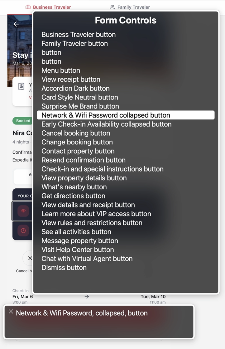
Form controls menu
Annotations
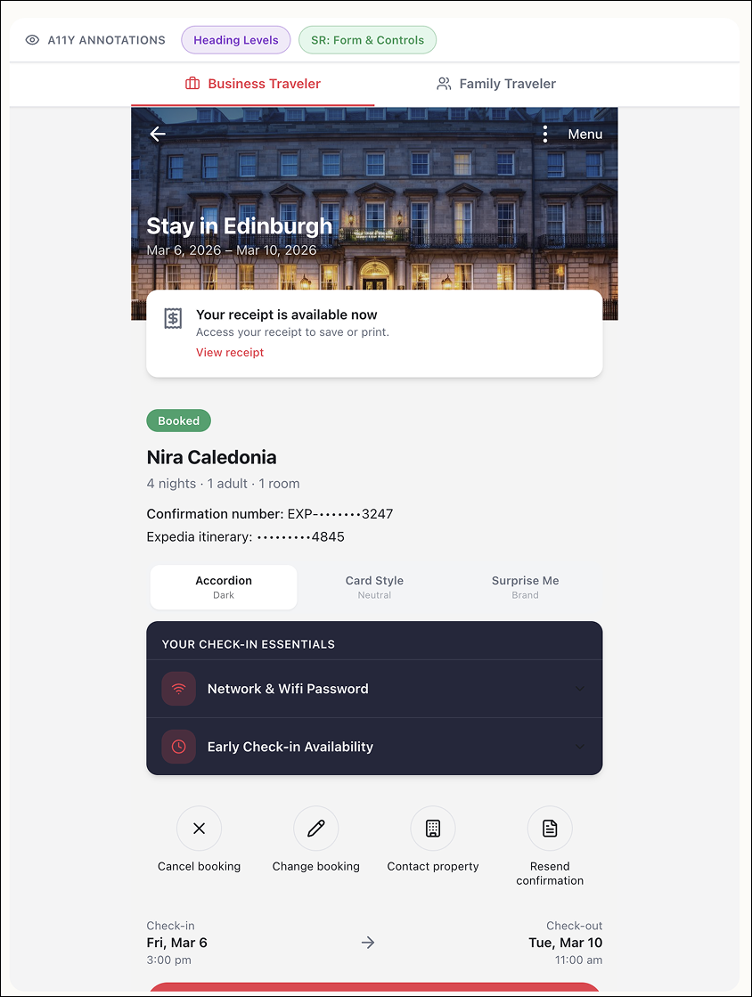
Once I had a feel for the structure and labels for the page, I decided to see if Loveable could create annotated views. As a UX designer, it’s my job to provide annotations to my engineering team, so any program going forward has to have this capability, whether it’s for creating or reviewing or both.
I prompted the agent to generate numbered, color-coded annotations separating:
Heading structure (purple)
Screen reader roles and states (green)
Annotation labels mapped accurately to the UI and reduced friction when reviewing structure against presentation.
What I observed:
The heading structure list does not follow the visual order of the page. “Check-in Essentials” appears before the name of the stay — likely because the module was designated as a Region. While technically defensible, this could be confusing for someone less familiar with semantic hierarchy.
The “What’s nearby” accordion lacks an explicit status (closed/false), unlike the accordions within Check-in Essentials.
The “Things to do near your stay” carousel cards are not treated as interactive elements and lack heading structure. While not technically incorrect, it weakens clarity from an assistive tech perspective and obscures content type and intent.
I was pleased that Loveable accurately mapped annotation labels to their corresponding UI elements. It made reviewing structure alongside presentation significantly more efficient.
Heading structure annotations
Screen Reader for Form Controls annotations
Agent Capability Spectrum
Across experiments, agent capability is not uniform. Some struggle with structural fidelity. Others execute patterns reliably but require explicit direction. At this point, v0 has consistently demonstrated stronger visual reasoning and more refined output — though it remains unclear whether that reflects a durable advantage or a temporary lead in model tuning.
The gap between agents is significant.
Was this a successful experiment?
Yes and no. In some areas, expectations were low — and the agent exceeded them. In others, expectations were higher — and the output fell short. What became clear is that capability is not binary.
What surprised me?
The speed at which competent execution is becoming normalized — and how consistently discernment remains absent.
Several agents can now generate structurally sound, technically viable screens in seconds.
But none independently protected hierarchy, accessibility, or brand nuance without prompting.
What did I not expect?
Stepping back, I did not expect how misleading the term “AI is correct” can be. Agents can generate outputs that look complete and technically sound. But correctness is often surface-level.
What would I have done differently?
At this stage, I would move beyond screens and lean into task and process flows.
Interfaces are artifacts.
Flows expose cognition.
Testing how agents model decision paths, state changes, and user intent would likely reveal more about their true reasoning limits than visual reconstruction alone.