
CASE STUDY:
Things To Do Search Experience Redesign
THE PROBLEM
Despite incremental optimizations, engagement in the Activities shopping experience continued to decline and conversion remained negative. Customers felt overwhelmed by the single list view and worried they were missing relevant activities, citing disorganization, redundant content, and filters that failed to meet expectations in usefulness or relevance.
PROJECT CHALLENGES
Introducing a new shopping pattern and architecture into a site experience that is historically led by the “bigger” lines of business.
ROLES & RESPONSIBILITIES
» External research
» Competitive & comparative analysis
» Task flow
» Information architecture
» Content strategy
» Interaction design
» Design
» Prototyping
» Ecommerce best practices
Existing task flow
Discovery: internal and external studies, audits
As part of the discovery process, I reviewed all the internal research and user testing the User Research team compiled related directly and indirectly to Activities and our customers:
generative research
competitive research
pain-point and impact summaries
previous user tests and analysis
I went wider and looked at internal studies and conducted my own external research and audits:
design patterns and information design
traveler journey lifecycles and corresponding decision points
reviewed Baymard Institute studies and best practices
performed competitive and comparative audits
Activities information audit and task flow analysis
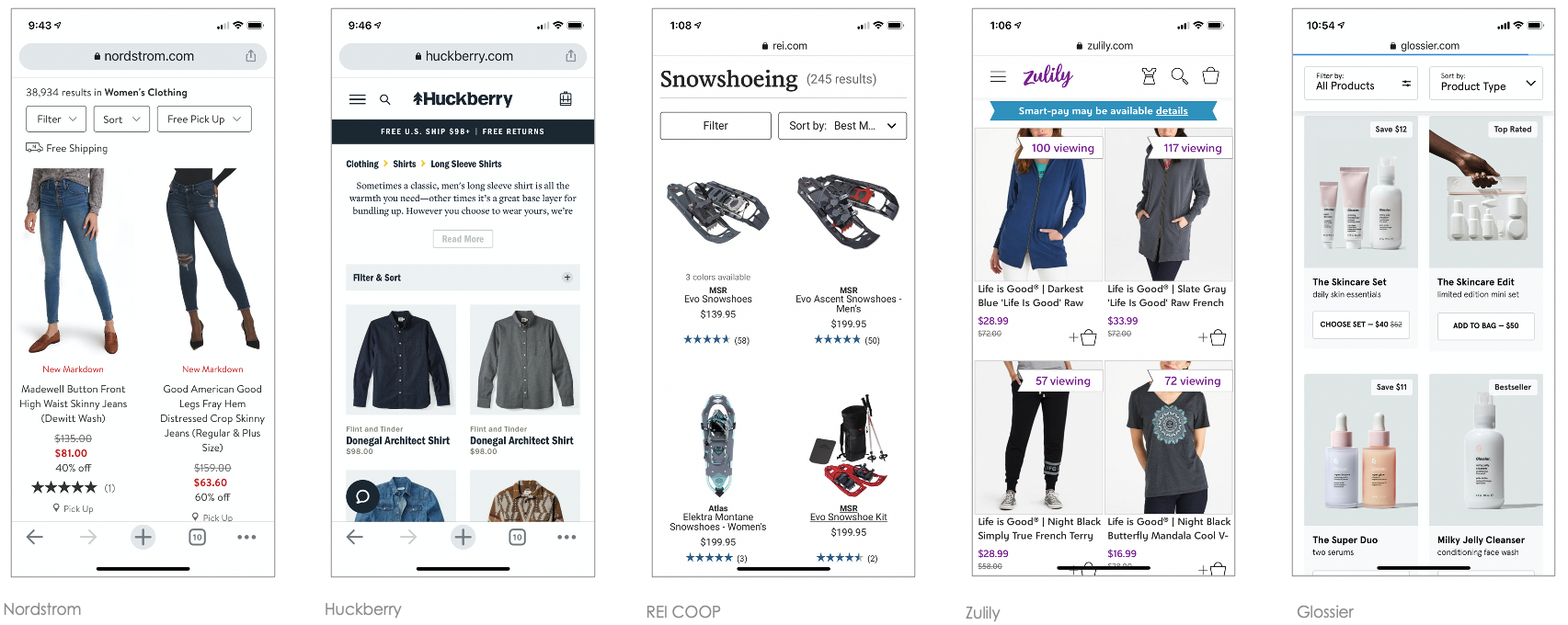
Key Takeaway: Searching for Activities has more in common with ecommerce than it does Lodging.
Creating an organizing principle
The Activities experience has activities organized into 20 categories and 120 corresponding subcategories
The experience was deep but narrow: customers landed on a destination SRP and scrolled an endless list of results, with each card linking to a PDP. To support orientation and wayfinding, we explored how to broaden the experience horizontally—defining the right structure and linking strategy. This work began with extensive whiteboard exploration.
Information Architecture
I grounded the IA in the existing categories and subcategories, establishing a proven structure with clear navigation and linking. This foundation enabled accurate wayfinding while preventing unintended errors and poor experiences.
Unlike traditional e-commerce, Activities shopping reflects travelers’ interests and preferences rather than fixed requirements. Travelers don’t journey for flights or accommodations—they travel for experiences. They explore destinations to understand what makes them unique and choose activities that align with their personal interests, goals, and desired experiences.
Contextual navigation
One of the most impactful changes was introducing in-page navigation using destination-specific categories and subcategories. Previously, these lived within the filters panel (or mobile menu), where they were difficult to discover and use, leading to a poor customer experience.
I recommended separating categories from filters and elevating them to primary, in-page navigation. Using existing design system components to move quickly and efficiently, I designed a navigation pattern with these goals:
Clearly recognizable as navigation and easy to scan
Predictable behavior aligned with user expectations
Clear display of destination categories, subcategories, and activity counts
Consistent placement across screen sizes
Efficient use of vertical space to prioritize activity content
Alignment with established brand standards

Controls distinction
However, with the introduction of the navigation, it required establishing business rules and definitions for future scenarios, such as when adding a new category or filter. Internally, as a team (engineering, product, UX, content) we had to have a shared understanding of what a “filter” was versus a “category” and how “filters” behaved compared to “navigation.”
Filter and results logic
Introducing in-page navigation required defining clear business rules for future scenarios, such as adding new categories or filters. The team aligned across engineering, product, UX, and content on shared definitions—clarifying what constituted a category versus a filter, and how navigation behavior differed from filtering.
Content organization and mapping
Beyond restructuring the destination-level information architecture, I closely examined activity cards based on customer feedback. Cards spanned the full width across devices, making them difficult to scan, compare, and evaluate quickly. This led to scroll fatigue and amplified customers’ fear of missing the right activity.
I led a “fierce reduction of elements” exercise, deconstructing and rebuilding each card to prioritize clarity and comparability. Card width was reduced to half on mobile and one-third on desktop, creating a slimmer, more scannable format. The redesigned cards were required to:
Surface only the content critical to decision-making
Establish clear hierarchy and relationships between information
Use short-form content where appropriate
Scale gracefully across scenarios without added cognitive load
Maintain established brand standards
The slim card pattern was also applied to carousels, particularly on small screens. Research showed customers often overlooked the existing carousel because its default “peek” state lacked a strong visual cue and resembled the full-width list view, reducing exploration.Prototypes and User Testing
Once the IA, content structure, and components were defined, I built a focused mobile prototype for user research. The goals were to understand whether the navigation was intuitive, the hierarchy flowed logically, and the slim card format provided sufficient information to support decision-making and click-through. We also evaluated how customers felt about the slimmer card format and increased information density—specifically whether the experience felt clearer or still overwhelming, and whether visual or cognitive noise remained.
Prototypes results
As user testing goes, the prototype was successful in the areas I had hoped to optimize, and provided additional learnings:
Layout felt clean, organized, intuitive, and engaging
Customers felt confident they were seeing sufficient choice and inventory
In-page navigation supported discovery of activities not previously considered
Participants preferred viewing categories in-page over carousel-based reveal
Slim cards provided enough information to support confident click-through and exploration
Rollout and next steps
Following the initial rollout, categories and subcategories were removed from the Sort & Filter rail to clearly separate browsing from shopping preferences. I also advocated for more relevant filters and context-aware sort options. Using a descent metaphor: the first release helped customers orient at 5,000 feet; improved filters were needed to bring them closer to the ground.
Once updated filters launched, clearer usage patterns emerged across devices—revealing behaviors that had previously been obscured by low engagement and conversion. With this clarity, the team could confidently target optimizations by device, timing, content, and traveler scenario.
After an initial COVID-related delay in 2020, implementation progressed steadily. Rather than shipping incremental changes, my product partner chose to release the full visual and structural update in a single rollout, including:
Breadcrumbs and page titles
In-page navigation and activity counts
Category- and subcategory-based IA (replacing filter-driven pages)
Page hierarchy and cadence
Slim card format with a short-form content strategy
BeforeAfterResults: +15% engagement and funnel progression
“Jen synthesized insights from competitive analysis, user research studies, and user data to overhaul the page’s information architecture, transforming it from an unstructured list into a clear hierarchy of destination and category pages. From discovery to the final MVP, Jen collaborated with research, engineering, analytics, and product at each step. She was instrumental to the team’s success and the new experience drove a 15% increase in funnel engagement and progression.”

Li Guo,
Senior Product Manager, Things to Do
Status update: 2026
The current Things To Do experience on Expedia Group is the optimized experience I imagined.