
CASE STUDY:
Traveler Discovery Experience
(Recommendation System)
PROJECT CHALLENGES
Limited Design Resources Two UX designers across time zones, neither fully allocated, and no dedicated content designer.
Compressed Design Timelines Approximately 3–6 weeks to audit, map, and deliver the initial schema, designs, and specifications.
New Mental Model Stakeholder discussions revealed this approach was largely new within Expedia, requiring alignment and reframing.
Pragmatic Execution As unknowns surfaced, we prioritized workable solutions that preserved the system and schema, even when aesthetics weren’t ideal.
ROLES & RESPONSIBILITIES
» External & internal research
» Stakeholder reviews
» Competitive & comparative analysis
» Information architecture
» Content audit
» Content framework
» Component design
» Design manager
» Design system specifications & documentation
» Accessibility annotations & compliance
How it started
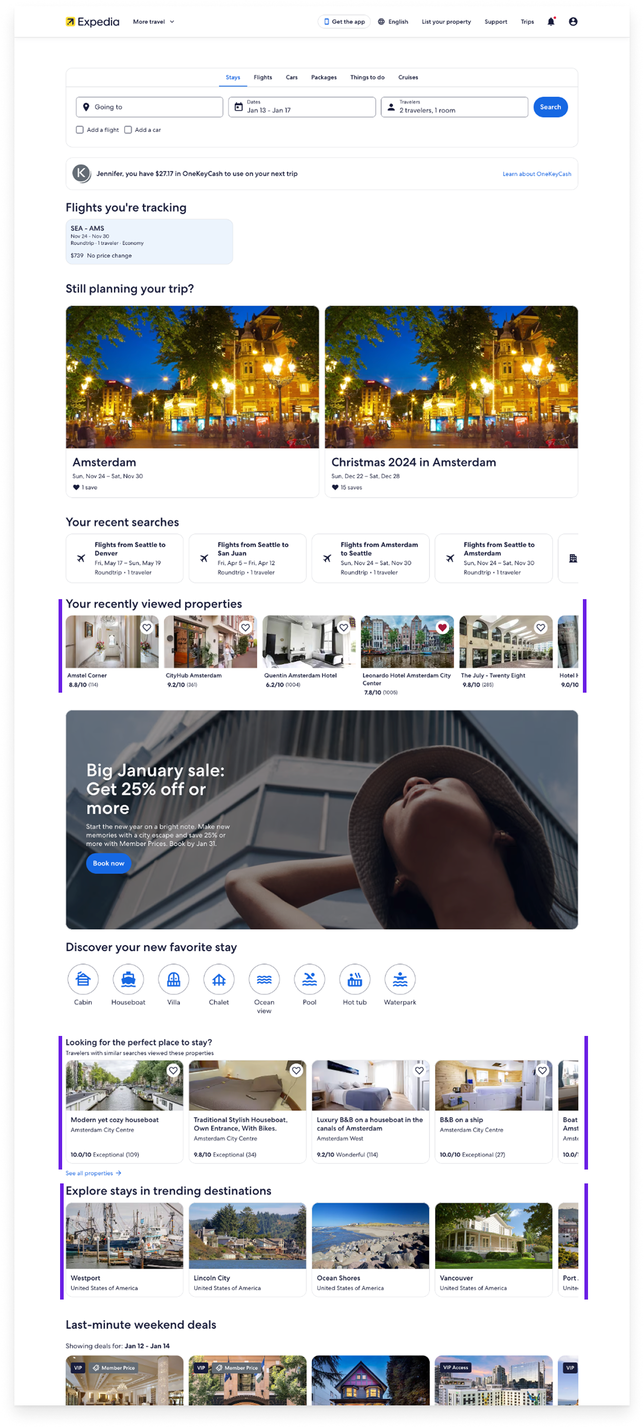
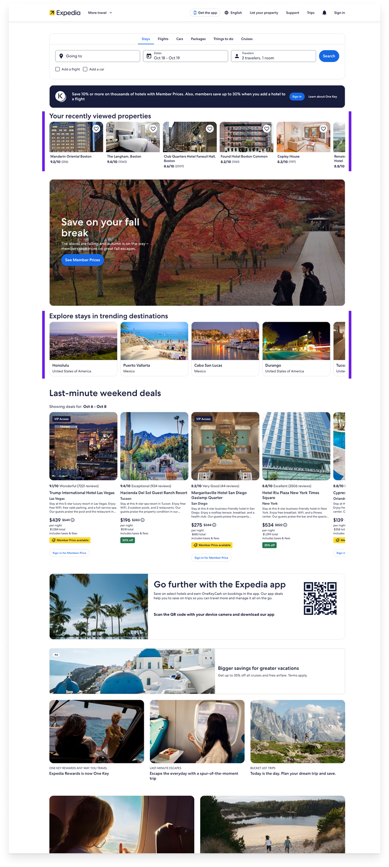
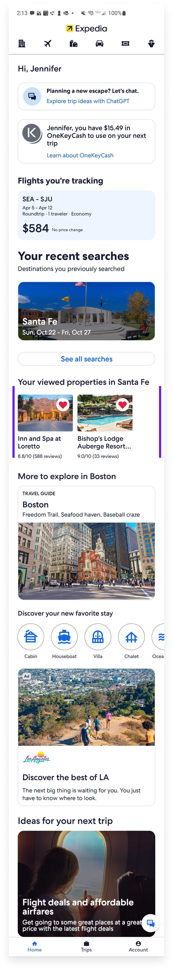
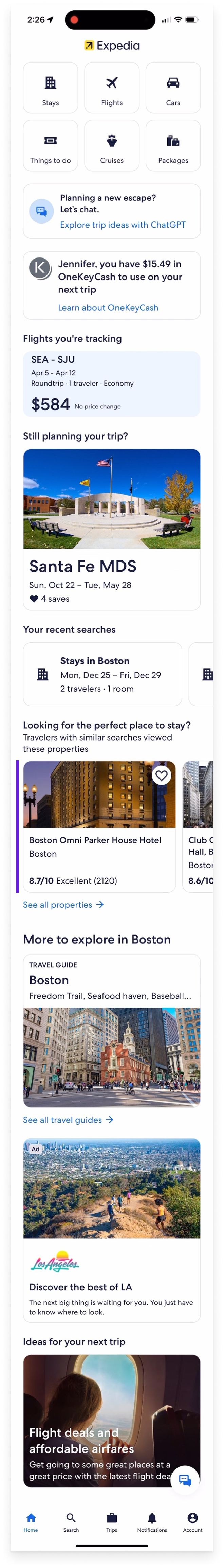
I knew from previous research on recommendations that Expedia’s were limited and sub-par from a competitive perspective. Every traveler visiting Expedia, regardless of preference, history, and interactions, were exposed to the same carousels populated with the same product cards.
The previous recommendations experience was described as, “Dumb”, “Unintelligent”, “Doesn’t apply to me, ever”, and “Useless.” (Ouch.) Internal stakeholders were frustrated with the lack of progress towards a unified, intelligent system. Meanwhile an increasingly disjointed experience was evolving as individual teams attempted to come up with their own personalized solutions.
When I was asked to incorporate an existing recommendation carousel into one of the Post-booking screens I managed, I knew it was the perfect opportunity to create and build a system that could be a more efficient, scalable, flexible and relevant experience.
Problem statements kept us grounded
The Problem for Travelers
Travelers expect personalized, relevant experiences when discovering and purchasing travel products. Expedia’s current experience relies heavily on generic search, with limited personalization and untimely or irrelevant recommendations—resulting in a one-size-fits-all journey that often drives travelers to explore alternatives.
The Solution for Travelers
For travelers, deliver intelligent, timely, and relevant recommendations across the journey—from planning through purchase. Presenting product and destination information in a consistent, uniform way reduces cognitive load and friction, enabling more confident discovery and decision-making.
The Problem for Expedia
Stakeholders partner with domain teams to deliver customized experiences across websites and platforms. However, these teams often struggle with inconsistent traveler experiences, inefficient knowledge sharing across touchpoints, duplicated effort, and slow adoption of domain features—resulting in fewer experiences shipped and tested within a quarter.
The Solution for Expedia
For internal teams, provide a modular travel exploration system that can be deployed across platforms. These reusable modules consistently surface product and destination information across lines of business, eliminating fragmented experiences, accelerating time to market, and enabling comparable performance benchmarking.
A real Shared UI approach & a content first strategy
Historically at Expedia shared UI components were built as one-off solutions tailored to specific business needs—often limiting reuse across contexts. Early in the project, I chose a different approach: design a robust, flexible system that could scale across lines of business and support roughly 80% of recommendation use cases.
I adopted a content-first, business-agnostic strategy—defining content requirements, mapping them to display types (e.g., EGDS, shopping patterns), and designing reusable card components and display mechanics (carousel, grid) for implementation across web and app.
What we’re trying to achieve
In order to avoid getting overwhelmed with input and commentary, we created a set of system guidelines or principles to share when necessary. This helped manage expectations outside the team, as well as produce more relevant, focused feedback and suggestions.
The system is:
Line of Business Flexibility
Support product information across multiple contexts, formats, and lines of business.Scalable, Consistent Design
Flexible and scalable patterns that accommodate both static product details and dynamic content.Maximal Reuse
Reusable content configurations designed to work across contexts and recommendation use cases.Continuity Through Familiarity
Limited to product information travelers already see and interact with on EG, reducing cognitive load.Intentional Design and Purpose
Designed explicitly as a recommendation card—surfacing the right level of information to support confident traveler decision-making.
The system is not:
Not a duplication of existing product or search results cards
Not an attempt to support every possible content detail or content combination.
Not a reinvention of the Expedia Group Design System; it leverages existing components and patterns.
Not limited to a single line of business, context, or use case.
Not an effort to “boil-the-ocean”—acknowledges there will be outliers and fringe cases.
Audits & analysis
Extensive audits, both internal and external, were performed to capture the following details:
Location (e.g., Home page, Search results)
Mechanic (e.g, List, Carousel)
Display patterns and versions
Content types (e.g., Title, Rating)
Information requirements
Content had to be identified, broken down, cataloged and defined across the four lines of business: Lodging, Activities, Cars, and Flights and we later added Destination and Location (Geography).
The goal was to be able to build consistent, LOB agnostic content framework, starting with the "Core” set which could be scaled down (Abbreviated) or up (Long form) as necessary. The amount of content was referred to as “Size.”
Overall, the exercise looked something like:
Identify shared (common) and unique content types
Deconstruct content types to elemental level (e.g., “Review count (x,xxx)”)
Define “core” content types and corresponding card visual display; should be LOB agnostic to avoid bias
Subtractive and additive methodology to determine both minimum and maximum content and card sizes
Scale up and down to determine the scope of application
Create a working taxonomy
Content identification and cataloging
Content sizing and taxonomy
Design requirements
Once I was confident in the content framework, the next hurdle was applying the framework to different Lines of Business (LOB) to determine if it was viable.
The design requirement phase included:
Comparing and aligning LOB content requirements and card displays to ensure appropriate scale and continuity; adjust and edit as necessary
Define content regions and corresponding content within said regions; lock content design
Pricing display spike, Badge display spike
Stakeholder education (show and share) and stakeholder inputs
Working content framework application, rev 2
Design specifications
As design requirements neared finalization, I began to consolidate and lock in the design specifications, identifying regions of the card with corresponding content types, followed by text specs and logic. This was repeated for each line of business.
Specifications include:
Content size
Card size and corresponding dimensions
Card regions (Product, Pricing)
Card specifications and business rules
Container specifications for carousel and grid
Elements (and their variants) design specifications; LOB examples
Early design specification documentation
Accessibility annotations & compliance
To ensure proper assistive tech experience and remain in compliance with WCAG 2.0 standards, comprehensive accessibility annotations were provided and implemented.
Accessibility annotations
The System Catalog
As part of the Expedia Shared UI Library, the recommendations system consists of the following card styles, configurations, and display capabilities, all prebuilt.
Teams may use and/or leverage the
pre-built card configurations in grid or carousel, or the individual elements, benefiting from speed to market entry and comparable benchmarking features.

Content and card specifications per line of business

Container specifications for different card size types
Configurations
Highlight/dynamic content
Primary title
Secondary title
Details list
Left/Right justified pricing
Badging
Title, Price, Rating, Pickup location (über)
With and without background fill or border
Card style
Long form
Foundation
Short form
Abbreviated
über abbreviated
Display type
Carousel
Grid (list)
Dialog overlay
Results: Nearly $6M in annualized GDP identified during initial A/B testing.
Instances on Desktop, Android and iOS highlighted in purple
“We built a dynamic platform capable of showcasing a wide range of experiences without ongoing development effort — but that scalability was only possible because of the content framework Jen designed. Her strategic thinking transformed a complex product challenge into a flexible, future-proof system, enabling us to scale efficiently and sustainably. Without her vision and structure, we would never have achieved the scale or efficiency we did.”

Neha Muchhal
Senior Product Manager, Personalization